Return on Rebranding Investment for Charities and Not-for-Profit

Return on Rebranding Investment for Charities and Not-for-Profit

Downturns or flat economic times are not great times for charities. Conventionally, tough times are not thought of as good times to spent hard-won cash on refreshing the brand.

But through the recession a surprising number of high profile charities including Macmillan Cancer Support, the Parkinson’s UK and Cancer Research UK to name a few; have invested in renaming, refreshing or updating their brands.

When the economy is slow charity begins at home: fewer people give and those who do give less. Charities have a choice: retrench or try something different in an effort to improve income. One key factor always remains, however; the clearer sponsors, supporters and sympathisers are about what the organisation delivers, its aims, its values, its practical work, the easier it is to engage them in the organisation’s work and secure financial contributions. This is the bench mark against which a not-for-profit brand should be measured: does it provide clarity and help explain the mission.

Charities that take the plunge to modernise, rebrand or refresh and have done so effectively have seen an increase in donations and corporate funders. Macmillan’s rebrand cost £120,000 on the back of which they pulled themselves to eighth in awareness among UK NGOs. Annual income rose from £97.7m in 2005 to £118m in 2009. The 8% real terms increase in income was accompanied by a doubling of the number helped and advised by Macmillan. Rebranding effectively can give the organisation new impetus, restating the purpose, placing its work in an up-to-date context and resulting in the body being taken more seriously by institutional funders and public bodies.

It’s not just the mega-charities that can benefit from a professionally executed re-brand. With a new CEO in place regional domestic abuse charity BWA first revisited their core values and set brand agency Public Impact the brief of updating and refreshing the organisation. Central to the task was changing dated perceptions. Funders and policy makers didn’t appreciate the breadth and depth of BWA’s service offer. The brief required a brand that put that right, emphasised the positive outcomes achieved for clients, matched the values and provided a platform for clearly communicate the extent of the service and the innovative partnerships in which BWA is engaged.

BWA’s aims and values process required the projection of the organisation as: welcoming and empowering, non-judgemental, offering places of safety; building trust, equality and raising awareness. Public Impact’s Creative Director, Jane Coney, sums up the rebrand as a change of tone to one of hope and optimism.

“Domestic abuse organisations like BWA offer the prospect of a new start for their clients. It is an opportunity for survivors of domestic abuse to move toward a more hopeful prospect. The brand needed to be about solutions not problems, hope not despair”, says Jane.

“As well as reflecting the values and projecting optimism we set out to create a BWA brand identity that would reach potential clients across traditional and digital media. The diverse, positive colour palette facilitates the future development of sub-brands, works well online and it has the visual impact to break through the noise as an effective platform for advocacy. It’s fresh, it’s modern but most importantly its use of illustrations is warm, welcoming and hopeful.”

BWA, has now secured medium term contracts to provide specialist refuge services to a number of key local authorities and continues to support a 6,000 call per year helpline, support and behavioural change programmes. Like many forward-looking third sector organisations, it reshapes itself and will continue to evolve. The brand now has the capacity to move with it.

Rebranding is often characterised as an expensive luxury – and sometimes agencies are their own worst enemy. Beware of agencies touting change that casts aside the value of an existing brand for the sake of fashion. Rebranding or refreshing an identity should build on solid foundations where they exist and need not be a huge outlay. A charity and with a coherent design and a strategic approach to rolling out the new brand can produce a return on investment within the first year.


Posted by John Howarth in Brand, Not for Profit, 0 comments
6 Actions to get donation on Not for Profit and charity websites

6 Actions to get donation on Not for Profit and charity websites

Improving and maintaining a donation income stream is an important part of any NGO or charitable organisation’s website. You would think so, wouldn’t you? But some not for profit bodies are better at using their websites to build their donor base than others.

What does best practice – and just good old common sense – tell us? To get donations we have to encourage donations, focus on answering potential-donors’ top questions and streamlining the donation process. Let’s start with the absolute essentials.

  1. Explain what you do – and keep it simple

Say what you do in clear, simple language. This might seem obvious, but many not for profit and charity websites do not clearly communicate in a clear concise manner. They can fail to say what the organisation does, how and why it is done.

Studies have demonstrated that websites that make the role of the organisation easy to understand have an advantage over those where goals and objectives are ambiguous. Explaining what you do in simple terms, without in-house or ‘right on’ jargon will be enough to encourage people who agree with the basic aims of the organisation to make a donation

  1. Tell people how their money will help

People are more cynical than they used to be. Not without good reason they want to know how their money will be put to good use. So tell people where their money will go and, again,  keep it simple. Tell people what the amount you would like them to donate will achieve – be it £5, £10 or £50.

There’s nothing new about this, but it works, so use it – and again keep it simple – use real number, not percentages. Stick to manageable, affordable amounts. Use examples that are as close as possible to the core purpose of the organisation.

  1. Endorsements are powerful

Your reputation is important to potential doners. People want to know about the impact you make and that you are a legitimate organisation. In this the words of others provide more that your own assertions. Potential donors will pay particular attention to:

  • name recognition
  • media reports of the organisation’s impact
  • high profile endorsements
  • testimonials of ‘real people’
  • number of years in operation

Not for profit or charitable organisations may have endorsements, case studies and recommendations on their website, but not always in the right context. They need to be visible and easily accessible in the context of a person considering a donation

Some of the most powerful endorsements are those from friends and family members. Testimonials and friends’ recommendations encourage users to act. Can form an important part of future campaigns – so be sure that the donor is encouraged to become an endorser.

  1. Have a big red button ready

It may seem the most obvious thing – but if you don’t ask you won’t get!

Not all websites have a clear donate call to action on the home or landing pages – they should have. But the donation call to action should be obvious on every page of the website. While research can tell you the most obvious triggers for donation, there can be a ‘long tail’ too – so when you push a user’s buttons they need a button to click. Again, keep it simple; use clear, concise words, especially when asking for money. Donateand Donate Now are immediately understood by users.

  1. An easy donation process

Once a potential donor has clicked the big red button the battle isn’t over. Complex registration processes are off putting and can mean that the donation is never completed. Keeping the donation process as streamlined as possible will increase the odds of getting users to complete the process. The fewer steps the better. Take care over the design of forms to ensure they are easy to use and, if you use a third party donation site, choose the ones that are simple, which users are most likely to have heard of and that allow a choice over registering to return.

  1. Capture interest and ask for more

The best websites enable supporters and donors to engage easily. When someone donates or is interested in donating it should be possible for them easily to register their interest. Modern inbound marketing technology can enable you to take sympathisers on a journey with your organisation giving you the opportunity to win further commitment, advocacy action or membership.

An Easy-To-Use Website and a Fast Donation Process Can Increase Donations

The impact of your website can’t be under-estimated. Getting the basics right makes a big difference. plain language, keeping it simple and easy to use means your site is more likely to turn traffic into the cash you need to be more effective.

Posted by John Howarth in Not for Profit, 0 comments
Promoting brands on Facebook

Promoting brands on Facebook

David Fincher’s excellent movie, ‘The Social Network’, tells the tale of how Facebook was something of an accidental business the possibilities of which only became apparent after its creation. While its use as a business platform is now well developed it, and its audiences, continue to evolve and many businesses are still new to the platform. These are some of the things to consider for those new to the notion of promoting brands on Facebook.

Social networking profiles represent people. From your Facebook profile, you declare personal relationships, grow your network by accepting friend requests, and other people in your network to add as friends. Your Facebook profile includes facts about you, what schools you went to, and your favourite quotes etc.

Your brand isn’t a person. You can’t friend a brand, and it certainly can’t friend you back. Brands don’t havefriends. Brands have fans. Fans have discussions about your brands, share news about them, and share information about your brands with others.

Facebook: The Favourite Social Network of Businesses’

A 2013 Business.com study of 3,000 businesses showed that 83% of respondents named Facebook as their favourite social network to engage with customers. As the network continues to evolve businesses become ever more adept at not only deciding if Facebook is right for their brands but also how best to use it.

However, marketing on Facebook hasn’t always been so easy for brands. When Facebook first began to catch on with businesses, it experienced a gold rush of brands who joined solely to do social media marketing. Just like nearly every other social network, the relationship between people and brands got a little messy. Remember, people you’re trying to reach have probably been using Facebook more often and for longer than you have. Unless your approach is pitch perfect you may end up doing more harm than good.

Profiles are for People. At this point in Facebook’s community’s development, you do not want to keep a profile if you are a brand. Keeping a brand profile is a surefire way to come across as totally out-of-touch. And worse, even if you were to pull off a successful corporate profile, Facebook has been known to suspend profiles for “too much marketing activity.”

Groups are for People. Groups really aren’t suitable for a serious marketing effort. They originally were created as a place for like-minded people to communicate outside of their immediate network and never were intended for brand use. There is very little time and energy required to make one and consequently, users do not value them as much as pages.

Pages are for Brands. After setting up a page for your brand on Facebook, use applications to pull in content from your blog and Twitter account (you do have those too right?) to keep your page full of fresh, frequently updated information. Resist the urge to turn your page into a watered-down version of your website. Include some offers, media or conversation on Facebook that does not appear anywhere else. Retail brands are especially talented at this.

Posted by John Howarth in Web & Digital, 0 comments
Secrets of Powerful Email Subject Lines

Secrets of Powerful Email Subject Lines

Email marketing is a powerful element of a marketing mix that combines digitial marketing, inbound marketing, content marketing and traditional techniques. Subject lines can make or break your campaign.

We all receive emails daily, sometimes hundreds, how will they notice yours? Will they actually open it and see what you have to say?

So you need to grab the attention of your contacts through your email subject lines. Checkout the secret ingredients we’ve uncovered to help you craft powerful email subject lines.

Develop Email Subject Lines with Four Principles:

  1. Keep it short and sweet

You’re not writing a book! Think newspaper headline. There is no reason for your title to be anywhere over 100 characters. A rule of thumb is 50 characters or fewer. Try for six words if you can.

If the title is too long, your contact won’t be able to see the entire title. Therefore, they won’t have any clue what your email is about.

A good concept to keep in mind is that the shorter your subject, the more your mail is likely to be read. Your contacts are receiving so many emails, they don’t have time to read them all. With a longer subject they might go right past your mail.

With the increasing number of people accessing their email on their smart phones and mobile devices these days, you might want to consider shortening the characters in your email subject line to as few as 20, so your subject will display properly.

2. Make it a Call to Action

Are you telling your contacts what they can do once they get to your mail? Think of your subject line as a call to action. Use verbs that grab the attention of your contacts, as well as telling them what they will expect once they land on the content.

A few suggestions on keywords for your subject line:

  • Download
  • Save
  • Meet
  • Register

3. Make it Personal

Personalisation is one of the easiest ways to provide your contacts with some sense of value. No one likes to be addressed as, Hi Loyal Customer. You should always know something about your contacts, even if it is just their name.

You should also format your email subject lines to reflect an offer or something that your contacts will want. A great way to develop personalised email content is through list segmentation. You don’t want to send your contacts an offer that they’ve already downloaded or something that does not interest them, therefore, it is important to know what offers and pages your contacts are downloading and viewing.

How to personalise:

  • Add name to subject
  • Provide something that interests that contact

4. Maintain Consistency Between Subject and Content

How many times have your opened a mail and it had nothing to do with what has highlighted within the subject? Probably once or twice. This could be the answer to why none of your contacts are actually clicking on the offers or call to actions inside.

If you take anything away from this article let it be this piece of advice, keep your content and subject consistent. What your subject promises should also correspond with what is delivered within your mail.

Still need some help?

Consider using the four ‘u’s’ approach when writing.

Subject lines should be:

  • Useful – is the promised message valuable to the reader?
  • Ultra-Specific – does the reader know what’s being promised?
  • Unique – is the promised message compelling and remarkable?
  • Urgent – does the contact feel the need to read?

To make sure you are getting the full benefit and return on your investment contact or call Public Impact, with our experience in creation of content your mails will be read.

Posted by John Howarth in Web & Digital, 0 comments
Quality brands need to get the basics right

Quality brands need to get the basics right

Digital technology made brand communications more affordable, more dynamic and more accessible. However the ‘democracy’ of the web and all its works has also made it harder to maintain the quality and effectiveness of brand management. Too often digital methods lead to bad DIY marcomms that forget the basics – like how to do a decent print piece.

Anthropologie (Anthro to its customers) is a well-known upper mid-market US brand relatively new to the UK and Europe. Their Regent Street, London store – best described as spectacular – opened only in 2009. They are the grown up wing of the much better known Urban Outfitters. Urban Outfitters, which targets a youth market, has either courted or stumbled into controversy on political and social issues but that’s for another blog, maybe. Anthro came on the scene in 1992, 20 years after Urban Outfitters was first launched as Free People. It’s appeal is to the same mindset.

Anthro stores are beautiful, usually. They stock beautiful things, in a particular style, but still beautiful. They are self-consciously middle-class and mildly eccentric. People who shop at Anthro know what to expect from the women’s clothing, homeware and gifts. In the many hours I’ve spent in Anthro stores (which generously provide sofas and beautiful books to leaf through) I have often been the only man in the store. Anthro is also rather expensive, particularly so outside North America.

The Anthro Christmas brochure fell through the letterbox yesterday. Of course it is a beautiful thing, in every respect art but a design and communications failure that lets down the brand. Why? Because it forgets the basics and the ‘joins’ between art direction, photographic, typographic and (when one looks as prompted) on-screen design are all too obvious and because the basics including the understanding of print processes have been forgotten along the way.

Five specifics:

  • Photographs lacking in contrast, failing to do justice to the products.
  • Products shown too small to do justice to their loveliness.
  • Products displayed in a way that means they cannot be seen.
  • A failure to understand that certain paper stocks absorb ink and so make dark images even darker.
  • Typography too small to see let alone read by most of the target age group
  • A page design that fails to draw in the reader because there is no cohesive order.

All of this can be directed at much of their website too. The same failings producing the opposite result – too much bleaching out, too little focus, the wrong page order.

Don’t get me wrong, there is some great stuff in there too. Anthro’s blog and their use of social media – Pinterest being a key sharing medium for this outfit – is engaging and a good example of how it can work. But if you are going to have an expensive, quality image then you have to follow it through. In days when hideously expensive 5×4 film was the medium of choice for studio product shots a little more care was taken over the results. Digital shouldn’t mean cheap. Brochures and website that looks as beautiful as the stores but in which the products are lost in a mudge of amateurism is a let-down for an otherwise quality brand.

Better luck next year, Anthro, in the meantime if you are interested in maintaining the quality of your brand or merely in ensuring that your digital and inbound marketing are not compromised by elementary errors then get on the phone to Public Impact or drop us an email.

Posted by John Howarth in Brand, Creative & Content, 0 comments
What is SEO Marketing anyway?

What is SEO Marketing anyway?

SEO stands for Search Engine Optimisation. It is all about promoting a website with the combination of techniques that make it likely to be found easily and listed by search engines such as Google and Bing.

There are a lot of different aspects to SEO marketing and different actions that help a site be found. Some are about the structure of your site, some are about the content of your site. It can all sound rather like voodoo at first – but it really isn’t. Improving a site’s performance in search engine listings through SEO isn’t a quick fix. It requires patience and application, but it is worth persisting as the results will certainly help your business.

When we are designing websites we are often asked questions on SEO. These are the most common.

Does our website need SEO?

Without some SEO it is unlikely many people searching the web will find your business, other than those who already know your name, that is. Of course you might get lucky, but for most business that probably isn’t enough.

Traffic on the web is mainly driven by the big search engines: Google, Bing and Yahoo – the ones you have heard of. Most web users will search for the product or service they want, rather than your business name. So traffic generated for your website by search engines in this way provides targeted traffic. Optimising your site for search engines means having the right content to be found in these searches, otherwise the traffic goes to your competitors.

Most research and a lot of bitter experience shows that search engine generated traffic will be a key component in achieving growth and business objectives. Generating more website visitors who are actually looking for what you offer enables you gain exposure, brand awareness, referals and publicity. It is crucial to the emerging techniques of both content marketing and inbound marketing. So putting time and money into SEO can generate spectacular rates of return on investment when set against other forms of marketing and advertising.

Do you need it – we would say so!

So search engines can’t find my site without SEO?

There are millions of sites on the web, your competitors are there, your partners are there and so are many of your customers.

The right SEO and the right content can mean you are found easily and on the appropriate searches. With SEO that’s not appropriate getting found can be very difficult indeed – readers will rarely look past the first two pages of search engine listings.

By making your content available to search engines in the right way you can generate thousands more visits and gain a business advantage

Can we do the SEO ourselves?

Most people understand the basics of Search Engine Optimisation – even if they don’t know it. You understand because you search yourself and that knowledge alone can make a difference if you apply it.

It all depends on the time you have – though you can start by ensuring that your content has the terms that you would search for within its text. Content is more and more important to search engines, in particular Google, which accounts for the largest share of the market. Google regularly updates its search methods to weed out many of the trick that were used to push sites up the listing in the recent past. If you are rebuilding your website plan for easily managed and deployed content including blogging which will help push you up the listings along with the use of social media.

If you are willing to learn then there is no reason you can’t fix your own SEO but like everything else your own time is money and it could pay to get in a consultant who can already has the knowledge and doesn’t need the learning curve. It might be that a highly focussed specialist is what you need but it is more likely that if you need to fix your SEO you also need to look at your overall website strategy to determine exactly what role in your sales and marketing you want your website to play in the future. A digital audit will establish the baseline from which you are starting and will act as a kick start to your thinking.

Posted by John Howarth in Web & Digital, 0 comments

QR Codes Boost QR Codes Boost Wokingham’s Live Travel Information

Real-time – or ‘live’ – travel information is part of an improved customer experience for both the modern public transport operator and the highway authority. Changing technology has not only improved the quality of real-time information but offers new methods of delivering the information to the customer in the most useful way.

QR codes offer an easy to use, low cost method of communicating the facility and delivering the information to the smart-phone user.

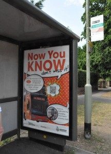
bus_stop_with_qr_code_campaignWokingham Borough Council commissioned Public Impact, which has a strong track record in a number of live travel information projects, to create an awareness campaign promoting the use of individual QR codes placed at bus stops.

“A QR code is simply a two-dimensional bar code that can be scanned by a smart phone app which in this case decodes to a web address that displays departure information for bus services for that stop. Once scanned the QR code can be saved as a bookmark for future use from anywhere. So the bus traveller at home can check how services are running for their journey, and can save any number of codes for stops on their regular journeys, enabling them to check the service for anywhere – of at least from anywhere with network reception!”, says Public Impact Creative Director, Jane Coney.

Public Impact responded to the brief by delivering a QR code real time information awareness campaign using a combination of bus stop poster advertising incorporating stop-specific QR codes and door-to-door leaflet drops at approximately 400m distances of the bus routes across two localities within the borough.

Since roll-out of the codes, monitoring of usage data has shown a 750% month on month uplift in traffic to the website via mobile devices and tablets, directly attributable to the inclusion of the codes. It is an exciting result and shows how transport systems can benefit from simple, user-focussed technology solutions. The campaign required only a modest budget funded from the Borough’s LSTF grant.

QR codes can work with any real-time updates, anywhere: train stations, bus stops, department store sales, live events, restaurant and entertainment specials or airline booking as well as many more static applications.

Posted by John Howarth in Communications, 0 comments
Not for profit & charity websites: get more donations and volunteers

Not for profit & charity websites: get more donations and volunteers

Good clear content is the key to getting donations.

To start with the obvious: the third sector: not-for-profit (NfP), charity, non-governmental organisations (NGOs) are different from commercial organisations. So are their .org websites. They generally don’t and mostly can’t present the clear value proposition that’s the key for commercial websites. Transactions take place because you want something they have and you’ll pay money to get it. For not-for-profit it’s different.

Non-profits must define and communicate their value proposition to attract volunteers and online donations.

Present Your Information Clearly

Your information has a value. It serves a purpose; part of your mission. The people who read it or download it want to use it.

Openness is key to securing donations. Finding the right information about an organisation helps validate trustworthiness and is the key to gaining more donations. To reach the potential of online fundraising and to extend the reach of advocacy not-for-profit sites must address the problem dogging too many web sites: poor content. Donors want clear concise information upfront.

Giving money

It’s harder to persuade people to give moneyaway than it is to spend money. Studies show e-commerce for NfP sites falls badly behind commercial websites for usability. Commercial organisations have learned that on-line buyers are creatures of habit who don’t like change. E-commerce for NfP sites needs to be simple recognised step-by-step process with which users are familiar as it mimics their commercial on-line interactions.

Giving stuff

Users can have a much more difficult time making a non-monetary contribution to a not for profit organisation on the web than they have giving cash. Giving physical items is a non-standard online transaction, so users can’t rely on a pattern they have experienced.

If users are asked to do something new on the web, the site needs to make it easy with simple step-by-step guides.

Volunteering

Donors are great, regular donors are really great but volunteers can be the people who win new donors and help the charity or NGO get results. On-line advocacy has taken off in recent years and the key is again to make taking action easy.

Simple, direct links to information on taking action from the homepage and any relevant pages are essential. Providing simple information about how to get involved, including how and where to help and upcoming events all matter – but the biggest deal of all is capturing the potential volunteer’s name and email.

NfP sites need to offer a fairly simple form for volunteering with clear calls to action and easy contact forms. Of course it all amounts to nothing unless it is followed up.

Joining

The Holy Grail for many third sector bodies is taking the individual contact on a journey from interest to donation, to supporting action, to membership. Not every NfP is a membership organisation, but those who are will want to engage potential members from information capture on their site and establish a dialogue – through email and invitation to participate.

Good NfP sites make joining easy, following the rules of e-commerce and remembering that those that don’t ask, don’t get – so the big ‘join now’ button matters, as does the ‘value proposition’ of what those who join the organisation get for their subscription.

Social Media

People don’t use Facebook to research the third sector to seek out places to donate.

It’s ‘horses for courses’ Social media is a channel of winning engagement and is great for offering advocacy opportunities. Content should draw the reader in and pull traffic to the NfP website where users expect to find the information on mission, values and the essential, easy ways of giving.

Posted by John Howarth in Not for Profit, 0 comments
10 design tips for websites

10 design tips for websites

Do you have a cluttered clunky website driving away prospective customers? How can you make your site an enticing place?

Here are our tips for improving 10 key aspects of designing websites.

10 Website Design Tips to Follow

  1. Navigation – Put some real thought into site layout, so customers can navigate it easily. Make sure all important sections are prominently listed. Link as many pages as you can into the main navigation bar, instead of having subpages from pages.
  2. Branding – Incorporate memorable elements of your brand into your website, such as your logo and company colour scheme. Make your logo prominent on your home page and put it on all subsequent pages to promote your brand.
  3. Home page – Visitors should be able to tell immediately what your site is about. Any call to action should be visually prominent on the page.
  4. Content – If your primary business is offline, just present enough clear, concise information to get customers to call or email. If you sell your products or services online, provide complete information to give customers the confidence to click and buy. Don’t put too much content on any one page, as Internet readers don’t like to scroll down.
  5. Refresh content – Changing content draws customers back. One easy way to renew your content without a lot of code changes is by starting a blog.
  6. Think SEO – Always bear search engine optimization (SEO) in mind as you design. Photos and splashy graphics may look nice, but likely won’t be read by search engines. One fix: have a text link that says “View portfolio” instead of a graphical button. The text will be more easily read by search engines.
  7. Colours – Use complementary colours that make your text easily readable. Clashing colours such as red text on a blue background make text too hard to read and turn off visitors.
  8. Be accessible – Make sure your contact information or a prominent link to it is at the top or bottom of every page of your site.
  9. Sound good – Music that starts playing automatically when your site loads is an automatic turnoff for many visitors. If you have sound, make sure it’s pleasant and easily disabled.
  10. External links – Links that take visitors away from your site should always load in a new window. Make sure your site stays in front of the customer, even as you provide them with additional resources.
Posted by John Howarth in Web & Digital, 0 comments
Why Should We Have to Retrain Graduates?

Why Should We Have to Retrain Graduates?

First published on the former Public Impact Blog in March 2013

In recent months we’ve come across a number of articles and blog posts lamenting the quality of design graduates being produced by universities and colleges in the UK. It is almost a hackneyed cliché to moan that the education system is ‘not responding to the needs of modern businesses’. But why should we have to retrain graduates who don’t have the basic skills necessary for commerical design or content marketing?

The worst thing about this recurring gripe is the queue of (usually) right of centre politicians lining up to nod in agreement or to see it as validation of their simplistic, ‘back to basics’ calls for addition ‘rigour’ in our schools.
Above: Fundemantal typographical skills are frequently missing from the armoury of today’s design graduate. 


Nonetheless my colleagues and I find ourselves wondering exactly what it is that design schools are trying to teach and if it bears any relation to the requirements of the ‘real world’ (or even its virtual counterpart). In talking to students and lecturers alike we see a disturbing lack of grounding in the basic skills that are required to work in a studio across a broad spectrum of delivery channels. We also see the requirements of the purely academic asserting themselves over the vocational.

We cannot help but conclude that the absorption of the colleges of art and design into the expanding ‘universities’ during the past couple of decades has produced nothing of any value. The object of the exercise should have been to raise standards, modernise courses and to produce a better standard of graduate. As it is I am uncertain of the benefit – degree certificates may have replaced HNDs and diplomas but beyond that we’re struggling.

Sometimes we wonder if we are expecting too much. But is shouldn’t be  unreasonable to expect any design graduate to understand and have experienced the typical software used in design houses; neither should it be unreasonable to expect that they will have experience of multiple platforms – PCs as well as over-priced Macs. If that IS too much to expect why would it be unreasonable to expect that a graduate would have the ability to prepare a file for press, to set up standard features like master pages or templates, to know when and how to use a baseline grid, or understand the fundamentals of typography? Perhaps it is unreasonable to expect that any self-respecting design graduate would at least have heard of the concept of widows and orphans even if they can’t remember which is which. And even if this is all out-moded stuff that doesn’t any longer matter why do we encounter web designers with no concept of what a search engine does and why that matters to the sites they wish to build?

It is easy to trivialise, but these are fundamental skills for any studio-ready graduate and in our experience students simply don’t know. These skills are just as important to the notion of teaching creative process and creative thinking because without them they will struggle to get past their role as a junior. If I had paid £27,000 for an essentially vocational degree that didn’t equip me for the basics of work I would be looking for my money back. £27,000 buys a lot of on the job training for potential apprentices who are much better placed to be useful without the salary expectations that accompany a university degree.

Talk of ‘rigour’ misses the point. Universities need to look at themselves, how they re-connect with the creative industries and what they are delivering in return for their fees or eventually students and businesses will vote with their feet.

Posted by John Howarth in Business, Creative & Content, 0 comments