It is easy to be cynical. After all every single technology trend is presented by one brand of techie as ‘absolutely essential’ and dismissed by others in various ways. The poor old business decision maker, marketing director or communications manager, who more often than not does not have a technical background, is left wondering who and what to believe. Listening to technicians is sometimes like listening to preachers of rival faiths – this is after all an industry that routinely puts the term ‘evangelist’ on the business cards of technical marketing staff.
I always remember two particular technicians pontificating. One telling us that Windows would never catch on because it wouldn’t work with database technology and another opining that websites should not have visuals and that website design was a matter for technicans who understood website design. Not him then!
It’s not about Technology
So let’s get a few things straight at the outset.
The web is not really about technology anymore. Sure, technical trends matter, new techniques and gizmos will always come around, but the web is a communication channel, a store or various kinds of hangout. It is that, not the technology, that really matters to you and your customers.
Neither is the web so much about computers as it used to be – at least not the ones that sit on your desk at work wired to a network. The web is about all sorts of devices and the web can pop-up on all sorts of places and screens. The most prevalent and what has changed the world is the use of smartphones and tablet computers across fast broadband and wi-fi.
80% of the world’s population have a mobile phone and one in five have a smart phone, in the UK there are at least 25 million smartphones and, according to US consultancy IDC, 87% of connected devices will be smartphones or tablets by 2017. PC sales have slowed – they will be around for a long time, but they just aren’t the way we browse the web anymore.
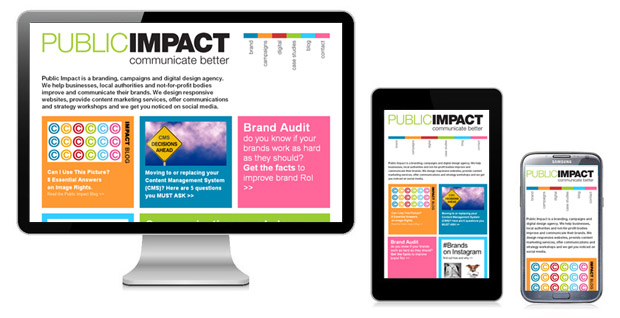
So what is a responsive website?
For the purposes of this discussion it’s a site that responds to the device on which it is being displayed and adjusts its presentation accordingly so that it is;
Readable – so not just a miniature version of the site for a PC browser, but appearing at the right sizes for a phone or table screen.
Looks right – the site’s layout is adapted, navigation is moved around so that it is logical and images are automatically resized to fit the screen and it all looks like it was meant to be there.
Usable – the site takes advantage of the features of the device on which it appears – such as working along with the common iOS features of Apple devices while panning, scrolling, pinching and pulling is eliminated or limited.
That’s it basically, the rest is technical detail. RWD (responsive web design) is one route, not the only route, to solving the problem of multiple devices. There are other ways to do it – specific mobile website design that draws from the same data and some may be right in some circumstances. There is also the ‘app’ based route: the idea that conventional web is much less suited to mobile devices. You pay your money and take your choice, your customers/viewers fundamentally don’t care.
The big advantage of RWD is that it is a single piece of coding for a single website with a single url (address) that just appears – more elegant, more cost effective, more adaptable to new screen sizes and more cost effective. Simples.
Why does any of this really matter to your business?
Well it isn’t just about devices, it’s about patterns of use. Not only do people now browse the web on different devices, they use it in different places. According to Neilsen only one in five UK smartphone users say they never use their phone while watching TV while more than 60% do so regularly – and more than half of them every day.
Online shopping has also shifted radically toward the table and phone with 41% growth of tablet-based shopping in the past year according to research by Rakuten – who among other things own Play.com along with steady growth in overall m-commerce.
Putting these trends together with what we know of online behaviour reveals the importance of designs that work across a range of devices. Since its emergence the online store has evolved toward a familiar and consistent format defined by the big players and adopted widely. In other words we ‘expect’ an online store to behave in a particular way just as retail experts will explain that we have expectations of the way a physical store is laid out, or what the experience involves. When it is different it is a barrier to those unfamiliar. The same rules apply to the web, only more so.
That means when a site appears on a mobile device we want it to behave as a site would on a PC browser AND to be consistent with the features of the phone.
All over this means that, however the techies choose to debate the technology there are six clear reasons why a responsive website is an absolute must have.
1. Mobile is the future and the now
Mobile accounts for more users more of the time and more searches (20% of all Google searches and more than half of local searches). One in four emails gets opened on a phone. If you can’t be seen properly on a mobile device you are already behind the curve.
2. Social media and blogs generate mobile visits
More than half the reading of social media, where links promote mobile-readable blogs happen through mobile devices. Links from blogs and social media to your website are less effective if the website can’t be seen properly.
3. A site that responds quickly is (still) essential
It was always true – if you have to wait your too late. People aren’t just lazy they are impatient and will just not wait around for your site, so optimising for mobile devices matters.
4. SEO is better with a single address
Google prefers sites with a single address over separate mobile sites. They have said so and if you think about how search engines actually do their thing it’s common sense.
5. Fulfil user expectations or else
Responsive sites deliver a familiar experience. If a user doesn’t get or can’t find what they want they will take their custom elsewhere. That means how it looks, how it feels and how the store behaves. Google say unless the experience is what people want there is a more than 60% chance users will leave immediately.
6. The site is more likely to work on future devices
You would be right to be cynical about ‘future proofing’ – it doesn’t really exist in technology. But some things are more future proofed than others. Because RWD ‘responds’ to the size of the screen rather than the type of device it is more likely to look right when a new screen size comes along on a new device. It’s not a guarantee – but the technology of RWD lends itself to relatively easy adaptation if necessary.
So choosing a responsive design is about the need to respond to how people view the web now and how they will do so in the future. It affects your choice of CMS, the design of your site and how you think about the audience.