Digital marketing is nothing if it isn’t visual. Getting better results from social media posts and ensuring that web site content produces sales leads are projects considerably aided by effective visuals. We’ve been looking at the simple points make by standout 2015 infographics.
Looking around visuals in 2015 a few have stuck in my mind and illustrate nicely some of the key points about more effective infographics (all copyrights acknowledged – in praise of the work of others – see links as appropriate).
Unity Makes a Point
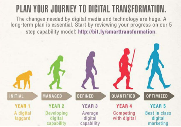
A little cruel this one but it gets the point across nicely – it takes longer to get digital marketing up to speed than you think. The strong, unified single image and strong headline makes an instant point that draws you toward the detail. Not sure the five year timescale is valid, but the main point stands.
Just the facts?
This image from The UK Government Department for International Development (DfID) spells out the facts of aid from the UK to Syria since the crisis began in 2012 in a series of stark images. The image presents as simple and truthful without making judgements. Like all facts they have a context – and they are the starting point of discussion. So much easier when there is clarity and a logical reading order. Have a look at the points we make here about not-for-profit infographics.

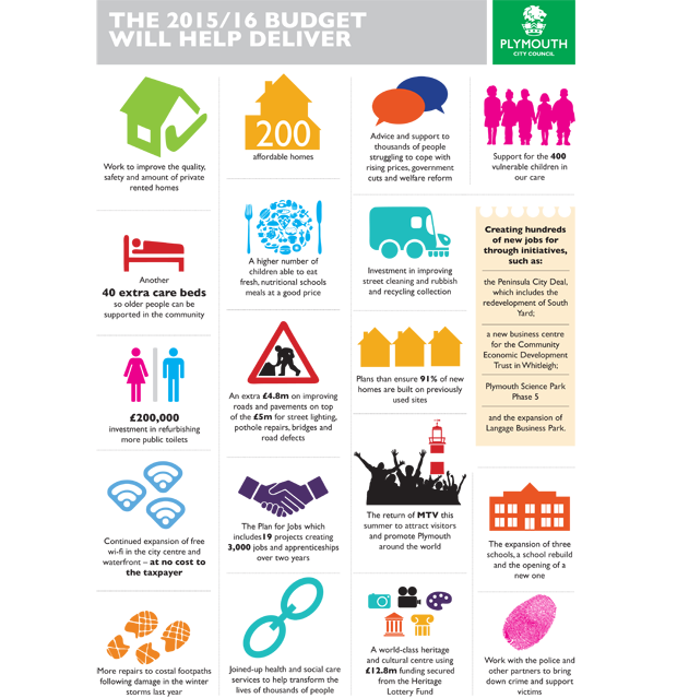
Doing a lot
Local Authority budgets are the stuff of sleepless nights for some and for the rest a cure to insomnia. Councils do a lot and deliver a lot – and it’s hard to take in. Plymouth City Council produced a excellent series of infographics to put across the scope of their budget using simple graphics on a clean background. Make a dry subject come alive with vibrant colour.
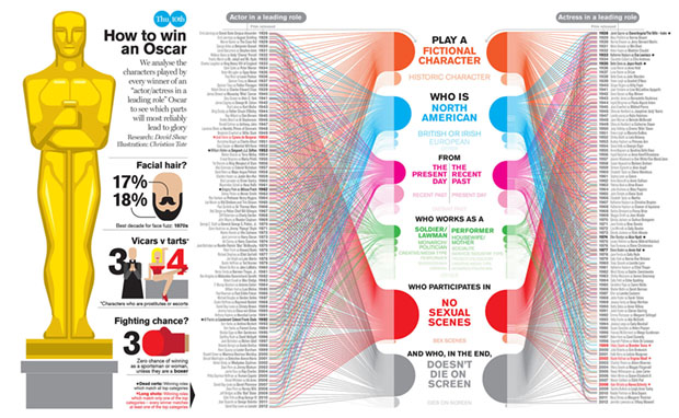
Fantastically complex but still fun
The Oscars have a reputation for playing safe and ‘The Academy’ is often dreadfully predictable. Apparently this is how to win an Oscar if you are a lead actor. Simples. The hard part, of course, is becoming the lead actor in the first place. The detail is impossible to see but that’s not the point – it’s the aggregation that’s important – an if you are really interested you can find the full size version on the link here.
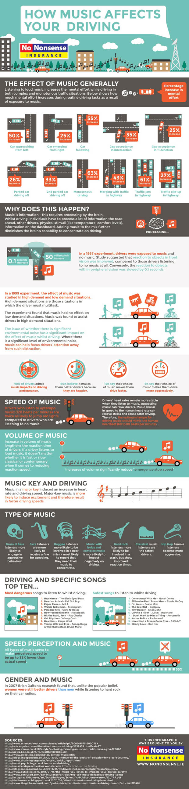
Challenging assumptions
This one is interesting. Who thinks listening to music helps their driving. I see a lot of virtual hands in the cyber air there. Wrong, probably. This one give some of the facts, seeks to educate, conveys lots of complex information but leaves out some essential facts. Like how on earth could it be that listening to Coldplay could possibly help anyone do anything?