Creative & Content

10 rules for not-for-profit infographics

10 rules for not-for-profit infographics

Oh and Happy New Year y’all.

Looking back through my 2014 timeline there were a bunch of images that nicely illustrate 10 rules for not for profit Infographics on Twitter.

Including images with Twitter posts dramatically increases both the effectiveness of the communication and the sharing potential of the post. That means you reach more people with a more memorable message. Not exactly rocket science, but what makes an effective infographic for social media sharing?

The more I looked at the graphics out there it seemed to me that getting it right isn’t so much about learning new rules than it is about remembering some old ones.

You Can’t Control Sharing, Remember the Brand

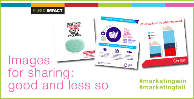
When an image is shared it is beyond your control. It can appear in any context, anywhere, anytime on anyone’s feed. In fact that’s exactly what you want but you DO want people to know where the image came from – and maybe even what they can do next. So spot the deliberate mistake:

Oxfam_Ebola

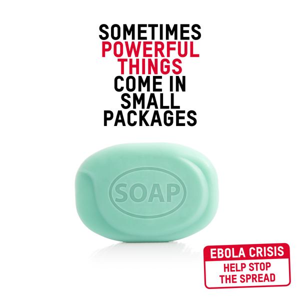
This simple image makes a simple point well – strong simple image andunambiguous wording. great, but what now and with who? If you want people to know who you are you might want to brand your image and if you want them to take action you might just want a web address or a hashtag.

Here’s another – it even caused a fuss in the media:

oxfam_perfect_storm

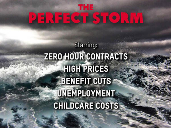
An easy mistake to make if you are an inexperienced organisation. As it is this was from Oxfam – not that you would know it; detached from their feed it might as well be from another planet!

WWF_wet

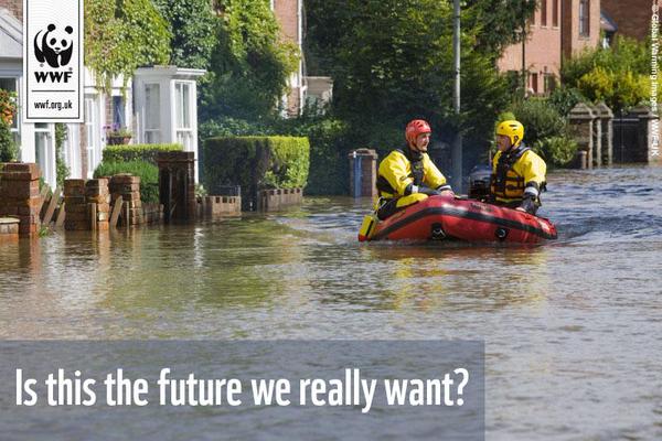
Also based on the essential and most powerful advertising formula – this image from WWF UK, who don’t forget to use their powerful brand and web address.

Name Sources for Credible Information

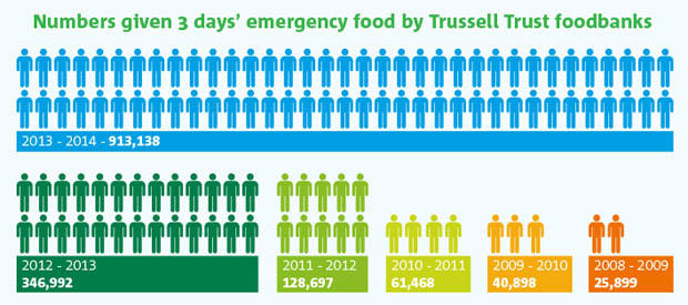
Awareness of message and facts about the issues being championed are often just as important as brand awareness. This is one of my favourite images of last year (and I make no apology for mentioning it again). Simply presented, colourful and powerful, the information speaks for itself. It states its source and the facts from Trussell Trust, operators of Food Banks across the UK, tell the story.

Trussell_Trust_Foodbank_Aid_Public_Impact_Blog

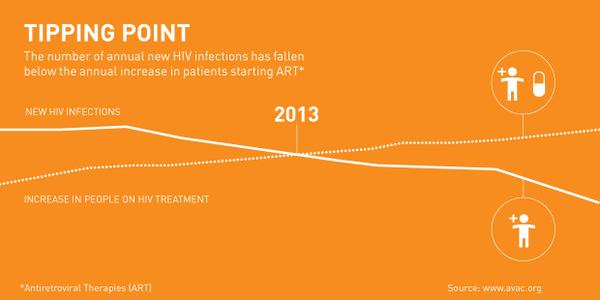
When I saw this infographic on World Aids Day I found the message encouraging – donors want to see the results of their work and when there is good news it needs to be told. The Bill and Melinda Gates Foundationpushed out this good news image with credible data, though once again, it’s unbranded. Disappointing but worse is the monotone presentation of data that could be so much stronger and almost unreadable type – a great story somewhat lost.

Gate_Found

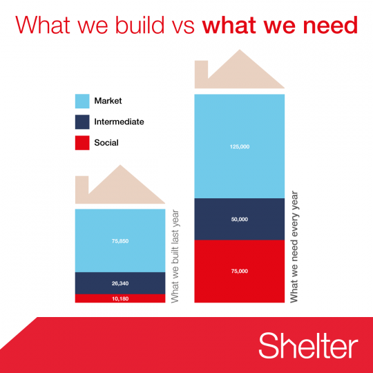
Shelter, the housing homelessness campaigning charity, get it right with this simple image to make their point that UK housing starts run woefully behind the need for homes.

shelter_housing_need

Keep it Simple, Keep it Clear

Twitter is an instant medium so impactful images are best. Also, images work best when their size is optimised to what works best for the medium. Twitter, for example, previews in the timeline at 435×375, Instagram images are square, Facebook – well, it depends on the latest redesign. There are so many networks and they change from device to device that it is hard to keep track of them all. Anyway, the image will be shared on different networks whatever you do – remember you are NOT in control.

All that said there are several good practice points to remember:

  • Make your point simply – less is more
  • Remember there is a limit to what readers can cope with – don’t try to tell the whole story
  • Think carefully about how people read and where their eyes will go
  • Challenge yourself – do you need every element – if in doubt, take it out.

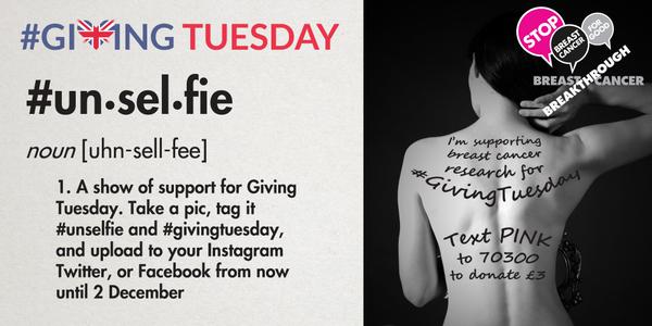
Breakthrough Breast Cancer do great work and their visual campaigns have involved people. There’s a bit too much going on here, but all the essential elements are present.

unselfie

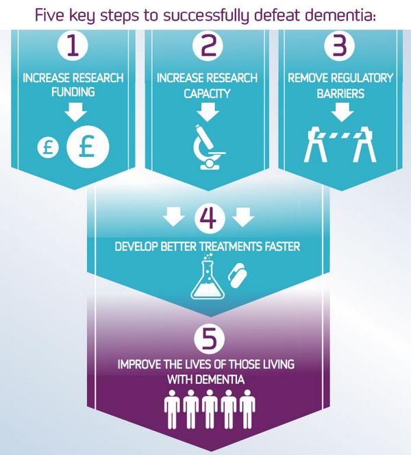
By contrast, Alzheimer’s Research UK explain their mission with this concise image – the only problem is who’s mission are we talking about?

Alz_Res

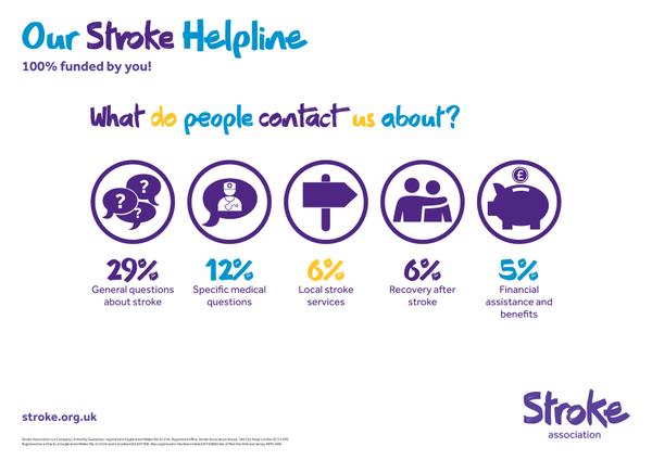
The Stroke Association are almost there with their series of infographics promoting the work of their helpline, and they and aren’t afraid of white space. In fact they get everything right except the use of three colours in a headline which weakens the message.

stroke_assn

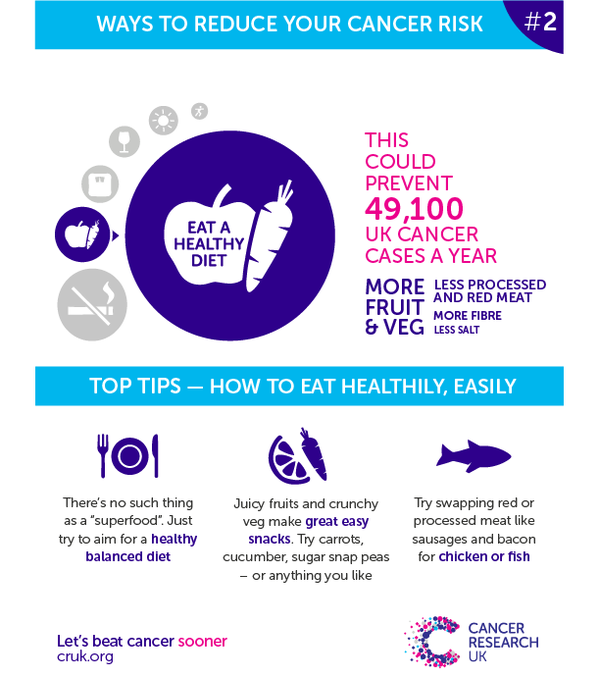
Cancer Research UK almost nail it –  it’s a series, it’s simple, it’s informative but they don’t seem to get hashtags! A series of images in a common style is an important way of amplifying your message and increasing recognition.

cancer_research_series

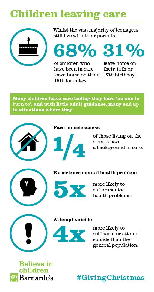
Finally, larger graphic can work on social media so long as there are well designed. Here Barnardo’s get it spot on explaining the facts about children leaving care.

barnados-car

Best Practice with Not for Profit Social Media Infographics

To sum up the 10 rules for not for profit Infographics on Twitter:

  • Brand your images for sharing: whether for blogs or social media
  • Include a call to action and somewhere to go next
  • Hashtags – include them
  • Less is more – don’t try to say too much
  • Think carefully about the size of the image
  • Use colour carefully and keep it on brand
  • Make your facts credible by including a source
  • Make sure your type readable in at 600 pixels square
  • Strengthen your point with a series of infographics
  • Remember how people read – keep it logical
Posted by John Howarth in Creative & Content, Not for Profit, Web & Digital, 0 comments
5 essential Instagram tips

5 essential Instagram tips

Driven by the increased numbers of smartphone users the image-based social network, Instagram, has now reached 200 million active users, sharing 60miliion photos a day.

The reach of Instagram, in particular in the USA, means that major brands are taking the network seriously. Instagram is fast overtaking other visual content networks like Flickr, Tumblr and Pinterest, its ethos is somewhat different but this gives it immense appeal in youth-oriented markets.  Lifestyle businesses without an Instagram account are already behind the curve, but any business can benefit from Instagram as part of their content marketing mix.

To make sure you’re using this social media platform to grow your business and generate more leads, Here are four essential instagram tips to make an impact:

1. Have a call to action in your bio (profile description)

Before thinking about your Instagram content, think about your profile. Your profile description is as important as having a well presented logo or bang-on-brand profile picture. The description, limited to 150 characters, should include a call to action and use hashtags. ie. #finedining #food #Londonrestaurants #indianfood. Book now at www.20centraj.com.”

2. Use photo & video apps to brand your images

There are great applications such as PicPlayPost and iMovie to edit videos. PhotoCollage, PicLab and PicsArt have the features you need to place your logo on the images.

3. Promote your Instagram post on other social media

Using Twitter, Facebook or Linkedin amplifies the reach of your Instagram marketing. Don’t just use text – post the image too sometimes to give viewers a flavour.

You can use an embed code found on your picture from the desktop version (not from your phone). From your phone you can use the ‘Share’ option to post to your Facebook profile or the pages you manage. You may also select to share your post on Twitter, Tumblr or Flickr. Use text that draws the reader to your feed – “more at Instagram @20centraj”, for example.

Public_Impact_Instagram_Images

Images from Public Impact’s Instagram – follow us @publicimpact

4. Direct your Instagram to your website

Each of your posts should direct back to your website with a call to action.

5. Stay cool, think square

Remember, Instagram images post 620 pixels square – so you are going to have to crop many of your images. There’s an art to a good crop, but it always helps to ‘think square’ when you are taking the image. This can be harder than you might think – years of using SLR and rangefinder style digital cameras may have formed rectangular ‘portrait’ or ‘landscape’ habits that your brain will follow without conscious thought. Ironically for such an ‘instant’ medium, old school users of Hassleblad, Rolliflex and other fabulously expensive square format machines have a distinct advantage.

Also remember that Instagram is relentlessly mobile – it’s a pain to post from your desktop PC, but a breeze from your smartphone or tablet.

And of course Instagram is social media – so the same rules apply – stay on brand, formulate and implement an Instagram Strategy, be careful of that damaging image and share, share, share.

If you found this article useful you will love our FREE social marketing eBook – many of the same rules apply.

Posted by John Howarth in Creative & Content, 0 comments
7 More Excuses for Postponing Inbound Marketing

7 More Excuses for Postponing Inbound Marketing

There are always a lot more reasons put forward for not doing something than for getting on with it. It may be an urban myth but the people who came up with the idea of organising climbs over the Harbour Bridge at Sydney, New South Wales were faced with one excuse after another from the City of Sydney and North Sydney Councils till they asked for all the reasons they could possibly think of for not allowing the climbs. They gradually knocked them away one-by-one till there was no good reason left for not going ahead. The Bridge Climb is now a major tourist attraction that pays for the routine maintenance of the Harbour Bridge.

Is Inbound Marketing your Harbour Bridge Climb? In our last blog we looked at seven typical excuses that hold up inbound marketing in not-for-profit.

 “Our Trustees Won’t Spend Money on Technology”

The web long since stopped being about technology. It is really about content and information underpinning promotion and awareness raising. However the same instinct remains with many trustees and board members – we should only spend on the mission, rather than the overheads. However that didn’t stop organisation printing leaflets, or brochures or appeal envelopes or producing tins to shake. The web is now the come of many other things. Marketing software and web integration is certainly an investment and needs a business case – and in an ideal world that case would be funded entirely from purpose developed grant aid. Consider using an external resource to help you build the case and the funding appeal so that 100% of donations ARE spent on the mission.

“People Won’t Fill in Forms”

They certainly won’t if they want information that they believe is more valuable to you than to them – like you Annual Report or Case Studies that tell the story of how you help. All sorts of people willingly provide information in return for something of value that you can provide. You demonstrate that value by providing useful information within your online content. Sharing the right information is important. Adding forms and landing pages to your site quickly proves this thinking wrong.

“We’ll end up asking too often by email”

It’s true that if you only bombard your contacts with donation appeals they will get tired and unsubscribe quickly – and that would be a shame. So don’t! You need the right combination of content and useful information that educates, enlightens and enthuses your audience mixed with a ‘soft-sell’ of information on how to donate and what it will enable you to do. The donate button might always be present somewhere – but readers will forgive that if it isn’t always the main purpose of the mailing.

“We concentrate on one or two annual appeals”

It really isn’t a question of one or the other. As not-for-profit moves toward events that are ‘moments’ in the virtual world, such as Movember, the importance of social networks, content strategies and inbound marketing to support appeals makes more and more sense. Try thinking about how content and inbound activity can support and enhance the build up to an annual event.

“We don’t have time to create new content”

Perhaps not. Activity expands to fill the time available and those of us who have worked in not-for-profit know that staff don’t spend their time sitting round with nothing to do. There’s even pressure on our time to think. But take a step back for a moment. Think about the content that you already have – on your current site, in newsletters, in magazines, in reports and studies, in the output of government departments or of the European Union. The fact is there is more content out there than you realise. The think a little about the news agenda – anniversaries are always a good start. Pretty soon you have the outline of an editorial plan just based on re-using what is there already.

“Our audience is not on Facebook”

Perhaps not – but maybe it is on Instagram, or LinkedIn or Twitter or watching YouTube. The fact is it is out there somewhere and only by asking your supporters and a little worthwhile trial and error will you know what’s best. Focus on the social networks that produce the most traction. Remember that social networks grow and change constantly. Ruling these channels out would be a big mistake.

“We’re Just Not Ready”

Nobody is ever ready but everyone kind of is! This is the most common excuse of the lot. You almost certainly have some of the essentials and in a technical sense being ready is easy – you have a website, a social network account and you know how to send an email. You have people too, so you are more ready than you think and you can get going but to do it well you do need to prepare a little then commit. You’ll need to optimise your website, you’ll need quality content, you’ll need to mug up on how emails can work and you need to understand the value of blogging in not-for-profit, easy ways to write better not-for-profit blogs and plan an editorial schedule. Most of all you need to know what you want to achieve and how you are going to execute you goals – an inbound marketing strategy. Assessing the readiness of your organisation is another key use for the skills of an external consultant who can set out a road map toward a fully functioning inbound strategy.

Posted by John Howarth in Creative & Content, Not for Profit, Web & Digital, 0 comments
7 excuses for postponing inbound marketing

7 excuses for postponing inbound marketing

Let’s start with six of the most dangerous words in the English language: ‘we’ve always done it this way’. Inbound Marketing in not-for-profit is a relatively new way of doing things. Like any new approach it requires change, but the biggest change is a change of mindset. Not-for-profit organisations, charities and NGOs can be among the most innovative advertisers and inventive marketers but just like private sector companies they can also find numerous excuses to put off change to another day.The excuses that we hear in our work, professional and personal, in the UK third sector are pretty typical reasons never to change that can be applied with a few changes to any situation. The danger is that by failing to grasp the nettle of shifting marketing efforts to the integrated digital approach know as inbound marketing good causes run the risk of having to play catch up in an unforgiving world.

1. “Our Trustees Don’t Understand Inbound Marketing”

This is probably right, they almost don’t get it as things stand. But there was a time when they didn’t get the notion of a website, or an email system or even having a computer in the office. However, it is essential for any charity, but particularly smaller charities and ‘not-for-profit SMEs’ that the Trustees learn how you can use inbound marketing to win supporters, members and donors. You also need Trustees to buy in to any move to inbound marketing. That means educating the board. Workshop approaches using external expertise can help broaden understanding and build the business case based on the excellent ROI from Inbound Marketing for not-for-profit organisations.

2. “Our target audience is older and not online”

Says who? It is a dangerous myth that needs to be dismissed. Research in both the UK and USA shows that not only are the target age groups of most charities and not-for-profits online, they are increasingly using mobile devices and talking to their friends on social networks. The perception is just plain wrong – most target audiences are reachable online. Think about who your customer really is. Look at the research, work out where they live online.

3. “Direct mail works for us – so we focus on that”

First of all postal direct mail is far more expensive than it once was. Second, it depends what you mean by ‘works’. Returns from postal direct mail appeals above 1% were considered stella in the days when direct mail was the main route to market for many NGOs and evidence suggests that not much has changed. Even a highly targeted list amounts to a scatter gun approach. Though first impressions might suggest otherwisesocial networks can offer a much more targetted approach. By contrast inbound marketing enables engagement by those who are interested in the work of your organisation. It doesn’t take a genius to work out that those with an interest are more likely to become active supporters or contributors. Take some of that direct mail budget, say half, and apply it consistently to direct marketing then assess the return on investment.

4. “Our priority is raising awareness”

And … inbound marketing in not-for-profit is an excellent method of doing just that, indeed it is central to the whole idea of inbound marketing. Your potential supporters are out there online looking for information about the cause you advocate. If they don’t find you they will find someone else. New and useful content – blogs, infographics, vlogs and trusted information pages – all helps online searchers find your information. It’s also cost effective.

5. “We are too busy to sort out our website”

Research by Public Impact has revealed that many third sector bodies have websites that are out-of-date, out-of-order or which are unable to work effectively on mobile devices. Remember those shops where the window display never changes – those ones where you don’t feel inclined to go inside until one day they aren’t there any longer? By neglecting your web presence you are neglecting the shop window of the organisation. So why doesn’t the website get priority? Often this is because the website has been seen as a cost – something that doesn’t or can’t wash its face. Inbound marketing turns your website into a machine for generating new prospects – so think about the content of your site and what your home page says about your organisation. Does it look like the sort of place you want to invest your money.

6. “We’ve had a blog and we just can’t find enough stories”

This is certainly an issue with which many people have problems. Those problems are largely questions of organisation and, once again, turning the thinking of the organisation outward. First of all there are many thousands of stories just waiting to be told in the third sector – many more so than in commercial organisations. Those stories; successes, needs, the implementation of projects, the production of positive outcomes, are inspiring and engaging. They are entirely appropriate content which most not-for-profits neglect. Content production can be learned with appropriate training or it can be bought in but think about what you have already first and how it can help tell your story.

The_Power_of_Not_for_Profit_Blogging_Infographic

7. “Inbound marketing is not part of our strategic plan”

Perhaps not right now, but the products of inbound marketing certainly are: new members, more donors, active supporters, improved awareness and there is a budget in the plan for developing these areas. In any case, plans are revised – as part of the plan. It they are not then they should be as a strategy, to be successful, must be a constantly evolving document. Prepare a plan for inbound marketing that meshes with your strategic plan that contributes to the goals of the plan and helps deliver those objectives.

That’s enough excuses for now – but there are more in the next blog on inbound marketing in not-for-profit!

Posted by John Howarth in Creative & Content, Not for Profit, Web & Digital, 0 comments
Quality brands need to get the basics right

Quality brands need to get the basics right

Digital technology made brand communications more affordable, more dynamic and more accessible. However the ‘democracy’ of the web and all its works has also made it harder to maintain the quality and effectiveness of brand management. Too often digital methods lead to bad DIY marcomms that forget the basics – like how to do a decent print piece.

Anthropologie (Anthro to its customers) is a well-known upper mid-market US brand relatively new to the UK and Europe. Their Regent Street, London store – best described as spectacular – opened only in 2009. They are the grown up wing of the much better known Urban Outfitters. Urban Outfitters, which targets a youth market, has either courted or stumbled into controversy on political and social issues but that’s for another blog, maybe. Anthro came on the scene in 1992, 20 years after Urban Outfitters was first launched as Free People. It’s appeal is to the same mindset.

Anthro stores are beautiful, usually. They stock beautiful things, in a particular style, but still beautiful. They are self-consciously middle-class and mildly eccentric. People who shop at Anthro know what to expect from the women’s clothing, homeware and gifts. In the many hours I’ve spent in Anthro stores (which generously provide sofas and beautiful books to leaf through) I have often been the only man in the store. Anthro is also rather expensive, particularly so outside North America.

The Anthro Christmas brochure fell through the letterbox yesterday. Of course it is a beautiful thing, in every respect art but a design and communications failure that lets down the brand. Why? Because it forgets the basics and the ‘joins’ between art direction, photographic, typographic and (when one looks as prompted) on-screen design are all too obvious and because the basics including the understanding of print processes have been forgotten along the way.

Five specifics:

  • Photographs lacking in contrast, failing to do justice to the products.
  • Products shown too small to do justice to their loveliness.
  • Products displayed in a way that means they cannot be seen.
  • A failure to understand that certain paper stocks absorb ink and so make dark images even darker.
  • Typography too small to see let alone read by most of the target age group
  • A page design that fails to draw in the reader because there is no cohesive order.

All of this can be directed at much of their website too. The same failings producing the opposite result – too much bleaching out, too little focus, the wrong page order.

Don’t get me wrong, there is some great stuff in there too. Anthro’s blog and their use of social media – Pinterest being a key sharing medium for this outfit – is engaging and a good example of how it can work. But if you are going to have an expensive, quality image then you have to follow it through. In days when hideously expensive 5×4 film was the medium of choice for studio product shots a little more care was taken over the results. Digital shouldn’t mean cheap. Brochures and website that looks as beautiful as the stores but in which the products are lost in a mudge of amateurism is a let-down for an otherwise quality brand.

Better luck next year, Anthro, in the meantime if you are interested in maintaining the quality of your brand or merely in ensuring that your digital and inbound marketing are not compromised by elementary errors then get on the phone to Public Impact or drop us an email.

Posted by John Howarth in Brand, Creative & Content, 0 comments
Why Should We Have to Retrain Graduates?

Why Should We Have to Retrain Graduates?

First published on the former Public Impact Blog in March 2013

In recent months we’ve come across a number of articles and blog posts lamenting the quality of design graduates being produced by universities and colleges in the UK. It is almost a hackneyed cliché to moan that the education system is ‘not responding to the needs of modern businesses’. But why should we have to retrain graduates who don’t have the basic skills necessary for commerical design or content marketing?

The worst thing about this recurring gripe is the queue of (usually) right of centre politicians lining up to nod in agreement or to see it as validation of their simplistic, ‘back to basics’ calls for addition ‘rigour’ in our schools.
Above: Fundemantal typographical skills are frequently missing from the armoury of today’s design graduate. 


Nonetheless my colleagues and I find ourselves wondering exactly what it is that design schools are trying to teach and if it bears any relation to the requirements of the ‘real world’ (or even its virtual counterpart). In talking to students and lecturers alike we see a disturbing lack of grounding in the basic skills that are required to work in a studio across a broad spectrum of delivery channels. We also see the requirements of the purely academic asserting themselves over the vocational.

We cannot help but conclude that the absorption of the colleges of art and design into the expanding ‘universities’ during the past couple of decades has produced nothing of any value. The object of the exercise should have been to raise standards, modernise courses and to produce a better standard of graduate. As it is I am uncertain of the benefit – degree certificates may have replaced HNDs and diplomas but beyond that we’re struggling.

Sometimes we wonder if we are expecting too much. But is shouldn’t be  unreasonable to expect any design graduate to understand and have experienced the typical software used in design houses; neither should it be unreasonable to expect that they will have experience of multiple platforms – PCs as well as over-priced Macs. If that IS too much to expect why would it be unreasonable to expect that a graduate would have the ability to prepare a file for press, to set up standard features like master pages or templates, to know when and how to use a baseline grid, or understand the fundamentals of typography? Perhaps it is unreasonable to expect that any self-respecting design graduate would at least have heard of the concept of widows and orphans even if they can’t remember which is which. And even if this is all out-moded stuff that doesn’t any longer matter why do we encounter web designers with no concept of what a search engine does and why that matters to the sites they wish to build?

It is easy to trivialise, but these are fundamental skills for any studio-ready graduate and in our experience students simply don’t know. These skills are just as important to the notion of teaching creative process and creative thinking because without them they will struggle to get past their role as a junior. If I had paid £27,000 for an essentially vocational degree that didn’t equip me for the basics of work I would be looking for my money back. £27,000 buys a lot of on the job training for potential apprentices who are much better placed to be useful without the salary expectations that accompany a university degree.

Talk of ‘rigour’ misses the point. Universities need to look at themselves, how they re-connect with the creative industries and what they are delivering in return for their fees or eventually students and businesses will vote with their feet.

Posted by John Howarth in Business, Creative & Content, 0 comments