Web & Digital

What are the right social networks for my business?

What are the right social networks for my business?

It’s easy to be cynical when you’ve worked with the technology industry for any length of time. The next big thing is always going to change the world. The next big upgrade is the ultimate change that’s going to deliver the ultimate user experience. Everything that went before is always obsolete. And so it goes.

Sometime it’s true. Once we can see beyond the hype, once we have the benefit of experience, once expectations meet reality we can see the trends that really made a difference to the world and how and we can see those that we just, well, hype.

To question the value of the latest technology trend is tantamount to sacrilege – especially for the technology industry. It’s an article of faith for many in technology that the latest thing must be better than what went before. It’s logical, after all, because if technology businesses don’t believer in the true faith then who will? After all, technology is a vested interest too. It is in the interest of all technology companies to promote the new over the old. It’s what they are in business to sell and given that so much new technology is, essentially, unproven in terms of its real delivery of bottom line or social benefits then its purveyors stand to lose from any evidence-based discussion of its real worth – because, by definition, at the leading edge we cannot really know.

All this sounds a bit Luddite – but far from it, I’m a real believer that technology can create a better world. It’s about sorting the C5s from the iPhones and then deciding what the new thing does for me. The best technology helps us do things of which we could previously only dream, the next best technology enables us to do things better than before with a great deal less effort. Questionable technology enables us to do thing we’ve always done – we just feel smarter.

We know a lot more now about social networks than we did, say five years back. I remember explaining, as communications professional to a tech enthusiast, that there was a massive potential down side to carelessly managed social networking in terms of reputation and brand management. He found this difficult to grasp – I dare say he wouldn’t today. Nonetheless, I still see businesses running social media in way that lacks direction or any sign of strategy. I also see businesses that have either given up or have not even addressed social media as a potential channel. The worst thing about social media is that it is largely free at the point of use. That’s been the curse of the Internet in so many ways. The unthinking social media user believes that ‘free at the point of use’ means there is no cost, ask if their time and their marketing section’s time was free too. It’s often the same people who fail to ask the question ‘what are we getting here?’

One of the most successful social media campaigns Public Impact has organised delivered a return on investment of 15,400% – or 154:1, which includes time and opportunity cost. This was an easily quantified campaign with a very direct bottom line outcome. It doesn’t mean that the same level of business couldn’t have been won by other means, but we do know that the ‘other means’ would have cost at least 6.5 times as much. We also know that in this case we were engaging with exactly the right people through Twitter while email and surface mail were considerable less targeted. The point here is not to suggest that we can get the same return for another client using the same methods, quite the reverse in fact – we couldn’t and wouldn’t make such a promise. The real point is that choosing the right media, or even if the medium is right at all, is different for every business and every product.

So if you haven’t asked the challenging questions about what your social media efforts are producing then it’s about time you did. Maybe start with:

  • How much is this social media thing really costing us?
  • What are we getting back and what do we really want?
  • Will social media bring in business and if not, what can it do for us?
  • Where does our audience live and which channels reach them?

You would be surprised at how many businesses have not considered these questions. I was, but not anymore. These questions come before anything like; ‘how do we make this work better?’, ‘how do we resource this?’ or ‘do we want to be here at all?’ and certainly long before ‘what is the competition doing?’ or ‘should I be on Twitter, Facebook, Instagram, Snapchat or what?’. But now that we know so much more can there be any longer any excuse?

While I would never promise a 154:1 ROI, I can commit Public Impact to help you challenge assumptions, to quantify what is really involved or what it’s really returning and, if you’ve not even gone there, to understand what really is involved. Then you will be able to look at your options and have confidence asking ‘what are the right social networks for my business?’ knowing you can come up with an answer based on evidence not just somebody else’s hype.


If you would like to take advantage of Public Impact’s experience of social media communications and start measuring what you are doing then click this link to get in touch.

Posted by John Howarth in Business, Creative & Content, Web & Digital
Rewards follow clear web strategy

Rewards follow clear web strategy

Working with the public and private sectors over an extended period during which web and digital technology has developed rapidly has given us an insight into the implications of strategic decision making.

In large organisations achieving any sort of agility in web presence is a rare thing. It seems to us that it has most often been achieved when the organisation in question breaks the web function down into components and has the vision to ensure that the different elements of the organisation genuinely take responsibility for the development and deployment of their own content. This approach runs against the grain in organisations where centralised decision making is the norm.

One of the fatal mistakes made by businesses of all types, but especially public sector bodies, is seeing websites are primarily a technology responsibility. In fact the web stopped being primarily about technology way back, yet for far longer technicians retained control, often with a level of responsibility for content and influence over its presentation way beyond their skill set.  Meanwhile those organisations with broader vision can still struggle with the real potential for devolved content management, their vision becoming hidebound by centralised administration and a lack of enabling skills and the failure to deal with imperial office politics.

Very few print rooms are asked by their clients to oversee the content of publications or to pass opinions on whether it’s appropriate to use imagery. Of course not, it’s a ridiculous notion – but that’s what organisations do with their web presence as a matter of routine.

In the local government sector the results are even worse. The adoption of standards based on futile attempts to anticipate the market and a false premise of ‘equal access’ has driven presentation toward the lowest common denominator and stifled innovation. The continued perception of the web as a ‘one off’ capital item, rather than a constantly developing revenue budget has also mitigated against progress. UK Government websites have reached a new low in presenting public information while ticking a myriad of boxes already out-of-date at first deployment. There are some signs of hope where the public authority is not the legal carrier, but it will take a major change of mindset to address the stasis.

Where organisations have moved with the market and adapted their web presence to available technology they have put themselves ahead of the game. The rapid take up of open source CMS, WordPress, led to an expansion in the after-market offering tools, templates, themes and serious tools for online business. Now the market leader at a canter, WordPress may lack the security features to create comfort for the carriers of large scale personal information databases, but the range of tools now available now permit the combination of horses-for-course CMS technology to address different elements of the web presence of a large organisation. Of course being the market leader will itself make WordPress more and more of a target for attack – something their future releases will need to address.

Crucially for SMEs, web platforms can now deliver rapid deployment without large capital outlay and can deliver ‘mobile-first’, SEO-optimised solutions with minimal technical involvement. This should make it more obvious that the essential ingredients of success are: an understanding of the audience, engaging content, a clear set of aims and the roles the site must fulfil and, most importantly, a strategy. Everything else – online brand guidelines, the platform, the content plan, house style guides, resourcing, budgets, technology decisions and tools flow from strategy. Understanding that addressing the website every couple of years just won’t do anymore is a good start.


Public Impact helps all kinds of business develop and implement strategic plans for web and digital communications. Contact us here to find out more.

Posted by John Howarth in Business, Communications, Creative & Content, Web & Digital
8 top SEO mistakes & some common sense

8 top SEO mistakes & some common sense

Search Engine Opimisation (SEO) can command high consulting fees which may prove well worth it when your website is finally found on the top page of Google listings. But SEO is not a dark art – it’s much more common sense and the incremental changes Google makes to its search algorithms make it ever more so.

The name of the game for Search Engine Optimisation is extremely simple. Once you’re up and running with the right tools and systems, all you need to do is publish new GOOD content on new pages on your website REGULARLY.

People get so confused about SEO – and it’s hard to see the wood for the trees at times. But, if you want to do SEO correctly, there’s one thing that you will spend the majority of your time doing: writing good content. 90% of the time you spend doing SEO should be spent writing about you, your industry, your business, your products, your services and the problems you solve for your clients.

Alternatively you could fall victim to one of these mistakes.

Top SEO Mistakes (and Common Sense)

  1. You’re optimising your website/blog around really common (probably really popular) keywords that you’ll never be able to rank for. In the last week, don’t pick common words such as ‘Leadership’, competing against Wikipedia and About.com you will never rank.
  2. All of your title tags has the same keyword phrase in it. And it’s your company name. The title tag on a page is probably the most important on-page SEO factor to consider when creating new pages. You probably already rank well for a search on your company name, so you can leave that out and still get that traffic. So, make sure you pick appropriate keyword phrases for each page that are phrases that someone is going to type into a search engine in order to find a product or service like yours.
  3. Dynamic URLs without your keywords in it. You bought a fancy shopping cart or content management system (CMS) that uses dynamic urls with all kinds of random numbers and random letters in the url. Your URLs should be readable by humans because search engines read words like humans too. These days good open source CMS like WordPress or Umbraco just do this – though you can also control urls manually. The words in your URLs is another very important signal to search engines what that page is about. So, get yourself a CMS that allows you to control your urls or get yourself a URL rewriter. Include your keywords in your URLs.
  4. You used images as headings. Headings are usually the big bold letters right above the content at the top of a page usually below your navigation. If these are “words built with images” (designers do this to control the font of the text), search engines aren’t reading them. These should be text. Pick a web safe font that’s close to what you want.
  5. If your navigation is built using image buttons instead of text, you’re giving search engine one less signal about what that page is about. Use text.
  6. Doing SEO after the website is designed and built. For some reason, people think SEO should start afterwards. Plan in the SEO requirements at the start. SEO done right allows you to determine what content to write in order to get traffic from search engines. And you shouldn’t design a site before you know what content will be on it. You may end up with a site that allows you to publish new pages and does not allow optimization of your site around your keywords without paying a designer or agency £££/hour to make the changes and additions for you. Someone that knows SEO will launch your website in a system that allows you to easily do SEO on a continuous basis.
  7. Our design firm “DID” the SEO for us. It’s great that SEO has been planned in but there is no such thing as “BEING DONE” with SEO. It’s an on-going thing. Doing SEO once is like your salesperson saying “I called prospects last month” as a reason for not calling any new prospects this month, what would you say to them right before you fired them?
  8. You built your website entirely in Flash. You might as well put an invisible shield up between you and the search engines because they don’t see you. It is not possible to do anything with SEO on site of this type. It’s back to the beginning with a CMS site.
Posted by John Howarth in Web & Digital, 0 comments
Content marketing distributors confirm trend to visual media

Content marketing distributors confirm trend to visual media

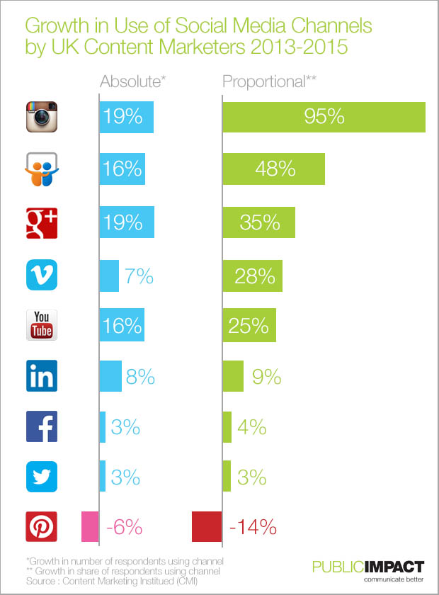
Digital marketing trends for 2016 look set to continue the long-predicted shift toward visual and audio/visual media. Figures for 2015 compiled by Lionbridge for the Content Marketing Institute and eMarketer show a significant increase in the use of visually-based social media for the distribution and promotion of content.

In particular the survey indicates that the proportion of content marketers using Instagram has almost doubled from 2013 – by far the biggest proportional increase. While some of this reflects consolidation within social media the bulk of the increase, as this blog predicted some time ago, is also because of the major brands now regarding Instagram as a serious and effective channel for brand promotion alongside the growth of the network under the ownership of Facebook since 2012. Go behind the figures, however, and an even more fundamental trend is pushing these figures. Instagram has always been primarily a mobile medium. It’s no surprise then that it should grow and be seen as more important by marketers as mobile devices account for an ever larger share of internet access.

content_marketing_social_network_trends_public_impact

The continued growth in the use of YouTube and, to a lesser extent Vimeo is in line with the desire to engage through video content. However, while more people are using video there remain serious questions about how well they are using the medium. The overwhelming majority of self-produced video content deployed on the internet remains virtually unwatchable. Webinars have the same problem. The significant growth in SlideShare – acquired by LinkedIn some time ago is hardly surprising. Sticking to the devil you know, the PowerPoint deck, offers an achievable means of distributing content with a minimal learning curve. Pinterest, where the user really needs to search and seek out content rather than have it offered on a feed, offers a more haphazard channel an one that seems altogether more difficult to measure – as marketers seem to be discovering. Pinterest seems set to remain ‘niche’.

As for the other networks, the level of use of Twitter and Facebook means there is only one way to go – and we should expect a decline at some point as marketers, still experimenting with social media refine their mix of channels. Google plus, however, continues to grow despite its change in direction, its usefulness in assisting search being central to its appeal. However Public Impact’s experience talking to businesses using social media in Newcastle upon Tyne and in Berkshire suggests that there is a long way to go before UK businesses and not for profit organisations use content marketing and social media marketing to their full potential.

Posted by John Howarth in Creative & Content, Web & Digital, 0 comments
5 simple points from 2015 infographics

5 simple points from 2015 infographics

Digital marketing is nothing if it isn’t visual. Getting better results from social media posts and ensuring that web site content produces sales leads are projects considerably aided by effective visuals. We’ve been looking at the simple points make by standout 2015 infographics.

Looking around visuals in 2015 a few have stuck in my mind and illustrate nicely some of the key points about more effective infographics (all copyrights acknowledged – in praise of the work of others – see links as appropriate).

Unity Makes a Point

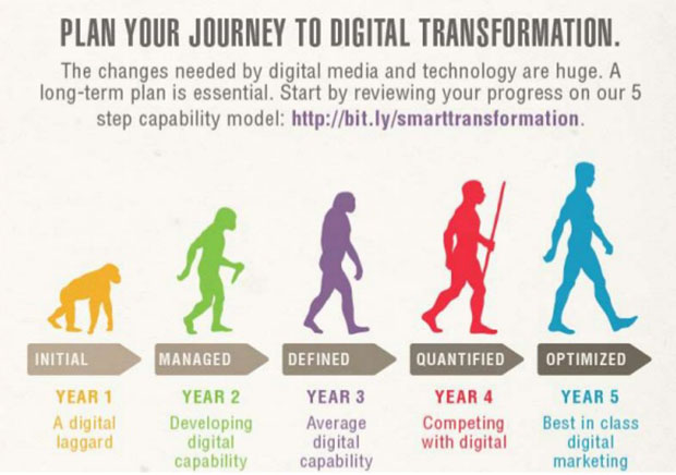
A little cruel this one but it gets the point across nicely – it takes longer to get digital marketing up to speed than you think. The strong, unified single image and strong headline makes an instant point that draws you toward the detail. Not sure the five year timescale is valid, but the main point stands.

digital_evolution

Just the facts?

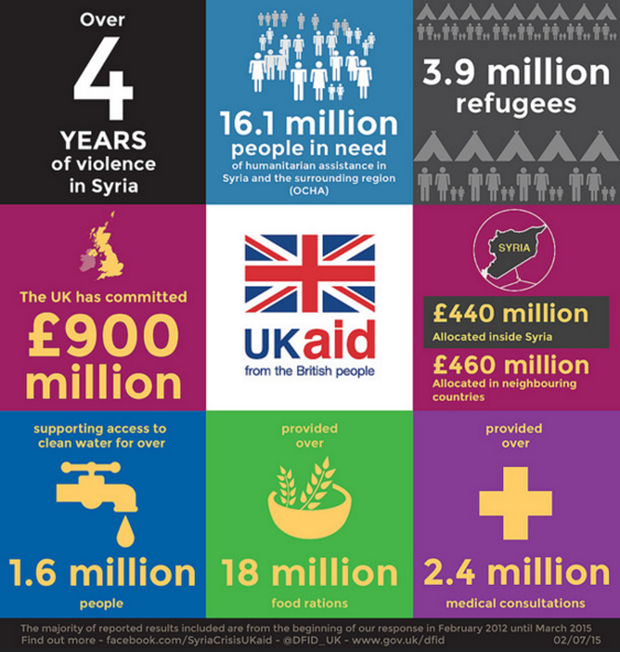
This image from The UK Government Department for International Development (DfID) spells out the facts of aid from the UK to Syria since the crisis began in 2012 in a series of stark images. The image presents as simple and truthful without making judgements. Like all facts they have a context – and they are the starting point of discussion. So much easier when there is clarity and a logical reading order. Have a look at the points we make here about not-for-profit infographics.

syria_aid

Doing a lot

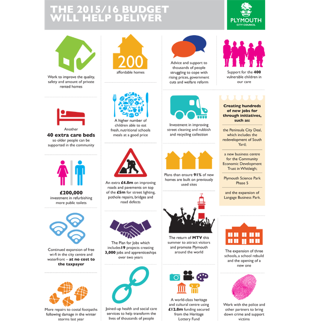
Local Authority budgets are the stuff of sleepless nights for some and for the rest a cure to insomnia. Councils do a lot and deliver a lot – and it’s hard to take in. Plymouth City Council produced a excellent series of infographics to put across the scope of their budget using simple graphics on a clean background. Make a dry subject come alive with vibrant colour.

ig1516budgethelpdeliver455

Fantastically complex but still fun

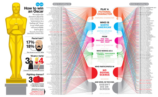
The Oscars have a reputation for playing safe and ‘The Academy’ is often dreadfully predictable. Apparently this is how to win an Oscar if you are a lead actor. Simples. The hard part, of course, is becoming the lead actor in the first place. The detail is impossible to see but that’s not the point – it’s the aggregation that’s important – an if you are really interested you can find the full size version on the link here.

OSCARS_landscape_1

Challenging assumptions  

This one is interesting. Who thinks listening to music helps their driving. I see a lot of virtual hands in the cyber air there. Wrong, probably. This one give some of the facts, seeks to educate, conveys lots of complex information but leaves out some essential facts. Like how on earth could it be that listening to Coldplay could possibly help anyone do anything?

music-affects-driving-infographic

Posted by John Howarth in Creative & Content, Web & Digital, 0 comments
5 Reasons Webinars Fail

5 Reasons Webinars Fail

I joined a webinar recently during which the will to live drained from my being – the presenter was a senior executive in a tech operation of significance. It isn’t the first time it has happened and I doubt it will be the last. To get the 90 minutes of my life that I’ll never have again out of my system I thought I would jot down these 5 typical reasons webinars fail in the hope that some will read and take not.

The webinar is a great notion – we can attend a presentation without having to leave our desks, travel, burn fossil fuel, catch someone else’s cold on the tube. It should all make us more efficient and help us marketing folk reach far more people than we otherwise would. The sad thing is there are many more bad webinars than good webinars. This is extraordinary because the media that define the rules has been around for many year: TV and radio. So apply a little common sense in to avoid the most common webinar mistakes.

It’s always too long

Think about TV formats. This is the stuff we have grown up watching. 40-50 minutes is a full drama episode – most often broken up by commercials. 22-25 minutes is a sitcom episode, 10 minutes in a news bulletin. These formats define our attention span. 90 minutes is a feature film!

The reality is left to our own devices the presentations we devise are always too long – it’s just the way we think as presenters – the more detail we provide, the better we feel we are doing; we want to tell people about the great things our brilliant products do – so we do, endlessly. But I also noticed that some people presenting webinars just ramble.

People turn off – or worse they invest more time feeling that they have wasted half an hour already and become steadily more irritated.

Who needs rehearsals?

Everybody! But it is quite evident that many of the webinars I sit through are entirely unrehearsed. The presenter is running through a demonstration or a PowerPoint deck without a script, without an opportunity to think about how they come across and without a ‘critical friend’ (or, God forbid, a director) who will challenge their performance and point to something better.

Of course it isn’t always practical to have others crit you webinar technique – but the technology is there to allow you to record the session and play it back through. Self-criticism is better than no criticism. Then there is the CEO, CTO or other Grand Fromage who floats in and delivers their rambling words of wisdom at great length. Needless to say there is a need for processes that apply to all if companies are to improve the standard of their on-line presentation.

One voice is rarely enough

Think about radio – most spoken word radio presentation is a conversation. The single voice reading or lecture is rare and the territory of professional voice artists, actors and so on. The single voice talking at length is a rarity, they make for dull presentation that struggles to hold the attention. It’s not that different when the webinar uses video streaming of the presenter. Ask yourself how long a single face to camera shot on TV lasts? Not that long – rarely more than 20 seconds and almost never longer than a minute – even on serious news broadcasting. A single talking head to camera will always struggle to hold attention for much longer.

PowerPoint (other similarly problematic presentation tools are available)

Too often, however, webinars simply reproduce all the mistakes of bad PowerPoint presentations over the wire: a single voice talking for far too long over a static slide, a single voice reading out the bullet points word-for-word, slides carrying too much information, too much text, over complex diagrams or badly designed visuals. It doesn’t work in a seminar room so why would it work online? A single voice talking over a PowerPoint deck can work in a webinar, so long as the deck is to the point and effective and the presenter is concise – though more than one voice is always better.

The demo that never ends

Technical demos also too often drone on forever with limited visual interest losing the interest of the viewer and failing to get the point across. This isn’t really the fault of the technical presenter, the failure comes down to the webinar producer who, even if they plan the rest of the webinar, simply hand over the demo to the technician.

Just like any other aspect of a presentation demos should be rehearsed, challenged, shortened and broken up into manageable chunks with contrasting voices. And like everything else the demo should be rehearsed. If the technical demo is central to the webinar then it is too important to be left to the techies.

Producing More Professional Webinars

So are your webinars key to your marketing strategy? If they are an early form of engagement with a potential customer then why on earth would they not be? If your approach is professional, rehearsed, well scripted, incorporates decent visuals and avoids the reasons webinars fail you will look good and retain interest. If not then what are you doing webinars for in the first place?

Posted by John Howarth in Communications, Web & Digital, 0 comments
How to Avoid 9 common mistakes on Linkedin

How to Avoid 9 common mistakes on Linkedin

What separates the great networkers from the amateurs? The clue’s in the name: ‘Network’. People do things on line that they would never dream of doing person-to-person. The best networkers behave online exactly as they would in a room full of people.

Lots of articles describe how to create a more marketable LinkedIn profile, how to find the right groups to join, how to choose the best profile photo etc.

Since most people understand the value of taking those steps, let's go deeper. To really harness the power of, don't make these 8 common mistakes on LinkedIn:

1. You give only so you can get

Connect with people on LinkedIn and you can write a recommendation that gets displayed on their profile.

That's fine, unless you're only giving recommendations because you want one back.

Give genuine recommendations. Recommend because you want to, not because you expect to get a recommendation in return. The people who know and respect you may return the compliment. If so, that’s great, if not, no harm done – and your face is still on their profile.

2. You just don't give

Successful networking is based on giving. Endorsements are an easy way to give: Go to someone's profile, click a few boxes, maybe click a few plus signs - done.

Endorse another person's skills and you not only give them a virtual pat on the back, you may also help them show up in search results.

Show other people you respect their skills. Sure, it may be a good networking move, but making other people feel good about themselves is reason enough.

3. You wait till you need

If you put off making solid connections until the day you need something--customers, employees, a job, or just a better network--then you've waited too long. Think about where you someday want to be and start now to build the connections, the network, and the following that will support those goals.

Building great connections is a parallel, not a serial, task. Later is always too late.

4. You forget where you are.

People use LinkedIn as a professional/business social network – even if their only purpose is looking for a job.

So when you leave comments, share material, post articles and so on, take the ranting outside. You never know when a potential employer, employee, customer, vendor--anyone--may notice. This doesn’t mean you can never disagree nor conduct debate or take a different perspective – just keep it polite, logical and professional

Safe, at least where being professional is concerned, means never having to feel sorry.

5. You don't share.

The easiest way to update and customise your profile is to share. Content you share appear in your Activity Stream, giving other people a great look at what you're doing and what you're interested in and creating a running journal where others can learn more about you.

Plus your connections can respond by liking or leaving comments, which helps you avoid another mistake...

6. You don't care.

Want to know what your connections, your network, or your audience thinks is important? Want a better sense of interests and perspectives you share?

Share, and then watch your Activity feed. See what people ‘like’. Read the comments.

The only way to better know people is to listen to what they have to say. Make it easy to listen: Share, see what strikes a chord and what doesn't. It's the perfect way to get direct feedback and build stronger connections. See your Activity feed as real-time feedback from the people you reach--and want to keep reaching.

7. You ignore your team

Relationships, referrals, and rapport are powerful ways to open doors.

The people you work with have networks – some might have really good networks (if then maybe they can be encouraged to build one) When you're looking for an ‘in’, see if someone on your team already has the right connection.

Chances are they do.

8. You don’t take the trouble

People appreciate it when you take the trouble.

"I'd like to add you to my professional network on LinkedIn."

Yeah, I know you're busy. Still, is using the auto-generated LinkedIn connection text really the best you can do - and it smells of spam

Delete the generic message and take a few seconds to say how you know the person. Or to say what you have in common. Or to say something complimentary. Unless you're just trying to boost your numbers, you have a good reason for wanting to connect, so tell the connection that reason.

9. An Inapropriate Photo

Or worse, fail to use a photo at all. It's just a fact that profiles without a photo get fewer views and fewer connections. Why would you connect with someone who's afraid to show what they look like and why would you hire anyone who was too lazy to find a photo. There's a whole other blog on mistakes with profile picturesand how to get it right.

Posted by John Howarth in Communications, Web & Digital, 0 comments
How to Create a Facebook Business Page in 5 Steps

How to Create a Facebook Business Page in 5 Steps

Facebook business pages are easy to set up and maintain. At the very least they help you get found on the web but they can also provide a great channel for reaching customers as part of your content marketing. The major consumer brands seem to agree. So here’s how to create a Facebook business page in 5 steps

1) Choose a Classification

Navigate to the following URL in a new tab to create your business page on Facebook:

https://www.facebook.com/pages/create.php

Once there, choose from one of the following six classifications:

  • Local business or place
  • Artist, band, or public figure
  • Company, organization, or institution
  • Entertainment
  • Brand or product
  • Cause of community

This classification will help you rank for more relevant searches and provide relevant information fields on your page.

After selecting one of the six, choose the category you’re in and fill out your business name (or if you selected one of the other options, your brand or company name). The business option also asks for further location information. Keep in mind that your category and name cannot be changed once your page is created. So type wisely, otherwise you’ll have to delete the entire page and start anew.

2) Complete Basic Information

Upload Photo

Facebook will now prompt you to upload the main photo for your page. This photo will appear as your icon every time you comment on a post or appear in news feeds. Ideally, it should be your company logo. The actual dimensions of your profile picture is 180X180 pixels. This will shrink on your page to appear as
125X125 pixels.

About Section

Next, you need to write your ‘About’ information. This small blurb will serve as the main 2-3 sentence description for your company. It will be on your main page, so make it descriptive but succinct. Be sure to include a link to your company website as well. Also ensure that this information differentiates your brand, making your page even more appealing to potential followers.

3) Use Your Admin Panel

Your admin panel is the main hub for managing your business page. It’s filled with various features and options to optimize your page and your monitoring of that page.

Edit Page

The ‘Edit Page’ option in the upper right provides various options. The first option, ‘Update Info,’ allows you to update the basic information you provided earlier in the tutorial. This will also allow you to enter a description, which is an extended version of the ‘About’ information you entered earlier. Users only see the description by literally clicking ‘About’ on your business page, so you should feel comfortable sharing lengthier and more detailed information in your description.

You can also manage the roles of your page administrators. This allows you to invite various employees from your business to be administrators on your Facebook page in order to respond to comments or messages specific to their function, without giving them complete power over your page. The other options under ‘Edit Page’ allow you to manage your notifications and add page permissions.

Build Audience

Often, marketers get so excited they started a Facebook page that they invite users right away. But challenge yourself to think about a more strategic method for inviting users. First, you want your page filled with content. Then invite your brand advocates to start engaging with that content. Once your page has some interactions, invite more fans and contacts, and they’ll be more interested to like the page when they see the buzzing hub it is. From that point, it’s at your discretion if you’d like to use Facebook’s advertising tools to further promote the page.

4) Fill the Page with Content

Cover Photo

With the introduction of Timeline came the introduction of your best visual real estate on your business page: the cover photo. The exact dimensions of this cover photo are 851X315 pixels. Be sure to select a creative horizontal image that will appeal to users who land on your page.

Custom Tabs

Facebook also allows you to have an endless amount of tabs on your page. You can only customize four of them — meaning only four can appear on the page before the user has to click the arrow to see the rest. Think critically about what you want to appear in these four slots, whether it’s events, photos, groups, etc. Keep in mind that if you use third party applications, you should configure the tabs to be indexed on Facebook and not on the third party server.

Posts

When posting on your page, be sure to use a variety of content. What images would your audience like to see? What stats would they like to read? What links would they like to click? You can also click the little star to the upper right of any post to highlight it horizontally across your entire page. Not only will this make it look like you have a cover photo on your actual timeline of posts, but it will highlight the page as a milestone in your company history. Use this feature for product announcements, business anniversaries, and other major events pertinent to your brand.

Monitor

While having a gorgeous Facebook page is great, you want to ensure you’re monitoring how fans are interacting with it. To the upper right of your Admin panel, you’ll see all the private messages users are sending to your page. Meanwhile, the upper left and centre of the panel shows all the posts users are liking and commenting on. Be sure to respond to comments and messages as needed to ensure your fans know you not only care about them, but to avoid the detrimental impact of ignoring these folks. Failure to respond via social channels can lead to up to a 15% increase in churn rate for existing customers.

5) Measure Your Efforts

At this point, you’ve built and shared a Facebook business page that accurately represents your business. Now you need to measure your efforts to ensure you’re making valuable marketing decisions on Facebook. Click on the ‘View Insights’ option to the bottom-centre of your Admin panel. You’ll be able to monitor reach, engagement, and the like in order to help you grow and adapt your Facebook marketing efforts around what’s working and what’s not.


Updated from an earlier post on the Public Impact Blog

Posted by John Howarth in Web & Digital, 0 comments
How to choose your LinkedIn profile picture

How to choose your LinkedIn profile picture

The first thing to say about LinkedIn is that it’s a business network. Some people say the only point of LinkedIn is looking for jobs. I think they are wrong. But even they are right – if you DO want a job, you would think about how to present yourself at the interview.

LinkedIn’s own research on how to choose your LinkedIn profile picture finds that profiles are “seven times more likely to be viewed” if a photo is included. So the biggest mistake is not having a photo. You wouldn’t go to look at a house without looking at a photo first – so why will anyone buy YOU when they can’t see your face. The conclusions people jump to are that you are: timid and unconfident, disorganised, lazy, embarrassed or just plain ugly. Unfair, I know, but who said life was fair?

So get a photo – but let’s avoid the most common errors:

LinkedIn shares 10 of the worst photo blunders you can make on your professional profile:

  1. A photo with a four-legged friend.Unless you’re a vet, don’t post a photo with your pet – as cute as it might be.
  2. A group shot.You need to post a solo shot. Otherwise how will people know who you are? Also,are your sure your friends want to be represented on your professional profile?
  3. A photo of your baby/with your baby. You’re growing your family and we’re all thrilled, but that doesn’t belong on LinkedIn.
  4. An old photo. It’s easy to choose a photo of ourselves at our best so it makes sense that a person might use a photo of themselves from ten years ago (or maybe a lot more). However, once they call you in for an interview or meet with you it looks a little odd. Keep you photo looking plausibly like you – now!
  5. An unprofessional photo.Are you at the beach, a night club or running a marathon? While you don’t need to be in your best business suit you do need to keep it professional. Best to avoid bare chests, wet suits, bikinis, sports kit or cleavage – no matter how fit you think you look.
  6. A wedding photo.Yes, it was a lovely day wasn’t it. We all know you spent thousands of pounds on hair, makeup and photographers for your big day. We know you’d like to make these photos last. However, unless you’re a wedding dress designer, you need to keep it professional when it comes time for a professional picture. Save the wedding ones for your personal album.
  7. Pixelated.Are you copy and pasting from a friend’s photo that comes out too pixelated or stretched out? You don’t want to look like something from the Hall of Mirrors. The whole idea of posting a photo is to put your best face forward. Have a friend take a few snapshots of you as opposed to resorting to a distorted photo. There are size guidelines on the LinkedIn site.
  8. Too serious.Photos should express vivaciousness and life. Not sad, angry or vacant stares, not the police line-up and not the one from your passport. Stick to colour rather than black and white shots.
  9. An avatar/cartoon image.You’re not a superhero, really, you’re not, you’ve never appeared in The Simpsons and you’re not a cat. Unless you’re a cartoonist or maybe an illustrator, having a caricature version of yourself reads immature in the minds of potential clients and employees.
  10. A photo of your product or logo.People want to connect with you as an individual, not with your logo. Once they connect with you, they’ll be able to learn about your product and your company via your company page.

So that’s what not to do!

How SHOULD my profile picture look?

Get a standard picture that represents your personal brand – take a bit of trouble and then use it on everything. Us comms types call it a ‘PR shot’ – one use is for your LinkedIn profile.

To gear users toward a more appropriate picture, LinkedIn shares 5 tips you can use for your own profiles:

  1. Dress to reflect professionthat you’re in or hope to join.
  2. Choose a picture that conveys your energy and personality.
  3. Be aware of your posture.Sit up straight. Good posture signifiesconfidence and competence.
  4. Make sure youreyes are relaxedand you have a smile on your face.
  5. Posting a photo is a must, especially for women who have married and changed their names. Or if you have a common name such as “John Smith,” since there can be several people with the same name on the site. You want to be found.

It’s all good advice

Posted by John Howarth in Communications, Web & Digital, 0 comments
10 rules for not-for-profit infographics

10 rules for not-for-profit infographics

Oh and Happy New Year y’all.

Looking back through my 2014 timeline there were a bunch of images that nicely illustrate 10 rules for not for profit Infographics on Twitter.

Including images with Twitter posts dramatically increases both the effectiveness of the communication and the sharing potential of the post. That means you reach more people with a more memorable message. Not exactly rocket science, but what makes an effective infographic for social media sharing?

The more I looked at the graphics out there it seemed to me that getting it right isn’t so much about learning new rules than it is about remembering some old ones.

You Can’t Control Sharing, Remember the Brand

When an image is shared it is beyond your control. It can appear in any context, anywhere, anytime on anyone’s feed. In fact that’s exactly what you want but you DO want people to know where the image came from – and maybe even what they can do next. So spot the deliberate mistake:

Oxfam_Ebola

This simple image makes a simple point well – strong simple image andunambiguous wording. great, but what now and with who? If you want people to know who you are you might want to brand your image and if you want them to take action you might just want a web address or a hashtag.

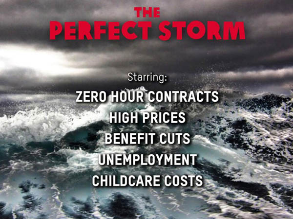
Here’s another – it even caused a fuss in the media:

oxfam_perfect_storm

An easy mistake to make if you are an inexperienced organisation. As it is this was from Oxfam – not that you would know it; detached from their feed it might as well be from another planet!

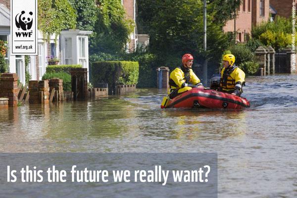
WWF_wet

Also based on the essential and most powerful advertising formula – this image from WWF UK, who don’t forget to use their powerful brand and web address.

Name Sources for Credible Information

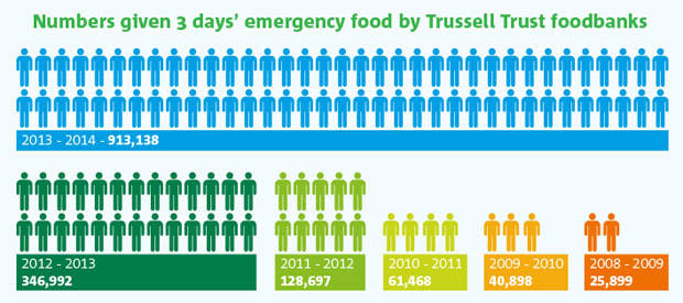
Awareness of message and facts about the issues being championed are often just as important as brand awareness. This is one of my favourite images of last year (and I make no apology for mentioning it again). Simply presented, colourful and powerful, the information speaks for itself. It states its source and the facts from Trussell Trust, operators of Food Banks across the UK, tell the story.

Trussell_Trust_Foodbank_Aid_Public_Impact_Blog

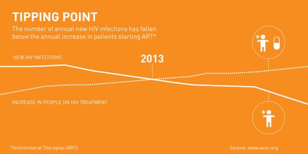
When I saw this infographic on World Aids Day I found the message encouraging – donors want to see the results of their work and when there is good news it needs to be told. The Bill and Melinda Gates Foundationpushed out this good news image with credible data, though once again, it’s unbranded. Disappointing but worse is the monotone presentation of data that could be so much stronger and almost unreadable type – a great story somewhat lost.

Gate_Found

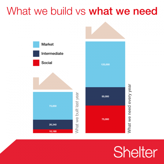
Shelter, the housing homelessness campaigning charity, get it right with this simple image to make their point that UK housing starts run woefully behind the need for homes.

shelter_housing_need

Keep it Simple, Keep it Clear

Twitter is an instant medium so impactful images are best. Also, images work best when their size is optimised to what works best for the medium. Twitter, for example, previews in the timeline at 435×375, Instagram images are square, Facebook – well, it depends on the latest redesign. There are so many networks and they change from device to device that it is hard to keep track of them all. Anyway, the image will be shared on different networks whatever you do – remember you are NOT in control.

All that said there are several good practice points to remember:

  • Make your point simply – less is more
  • Remember there is a limit to what readers can cope with – don’t try to tell the whole story
  • Think carefully about how people read and where their eyes will go
  • Challenge yourself – do you need every element – if in doubt, take it out.

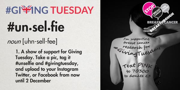
Breakthrough Breast Cancer do great work and their visual campaigns have involved people. There’s a bit too much going on here, but all the essential elements are present.

unselfie

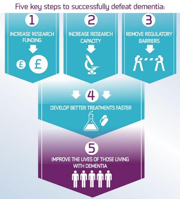
By contrast, Alzheimer’s Research UK explain their mission with this concise image – the only problem is who’s mission are we talking about?

Alz_Res

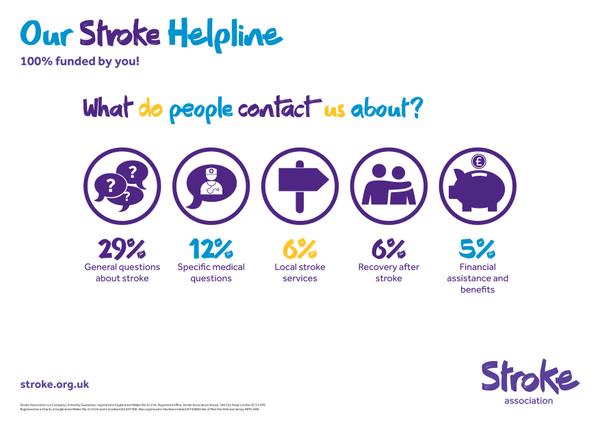
The Stroke Association are almost there with their series of infographics promoting the work of their helpline, and they and aren’t afraid of white space. In fact they get everything right except the use of three colours in a headline which weakens the message.

stroke_assn

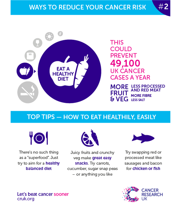
Cancer Research UK almost nail it –  it’s a series, it’s simple, it’s informative but they don’t seem to get hashtags! A series of images in a common style is an important way of amplifying your message and increasing recognition.

cancer_research_series

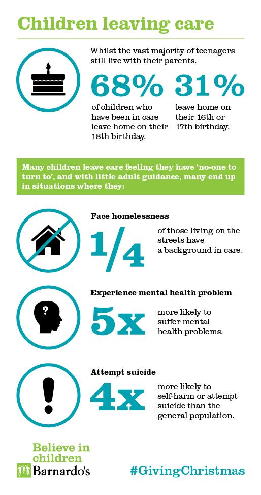
Finally, larger graphic can work on social media so long as there are well designed. Here Barnardo’s get it spot on explaining the facts about children leaving care.

barnados-car

Best Practice with Not for Profit Social Media Infographics

To sum up the 10 rules for not for profit Infographics on Twitter:

  • Brand your images for sharing: whether for blogs or social media
  • Include a call to action and somewhere to go next
  • Hashtags – include them
  • Less is more – don’t try to say too much
  • Think carefully about the size of the image
  • Use colour carefully and keep it on brand
  • Make your facts credible by including a source
  • Make sure your type readable in at 600 pixels square
  • Strengthen your point with a series of infographics
  • Remember how people read – keep it logical
Posted by John Howarth in Creative & Content, Not for Profit, Web & Digital, 0 comments