Five things to ask before hiring a brand expert

Five things to ask before hiring a brand expert

Because a brand expert really ought to know

Regular readers of this blog will know that amid the cascade of cheerfulness and enthusiasm there is the occasional grumpy note. For new readers, it’s best I tell you now that this one’s a little grumpy – but stick with me, please.

I received an email a couple of weeks back, supposedly from a supposed ‘expert’ in branding – or at least that what the grandiose job title said. What is it with job titles these days? I try not to get angry, I really do, but this one made me angry and every time I think about this brand expert I two weeks on I still feel irritated.

Mr Expert (real names have been changed to check the culpable) told me that it was “essential” that businesses like mine “rebrand regularly” to keep our image up to date and went on to explain that “every leading business knows how important it is to re-brand”.

It makes me angry because it’s exactly the kind of thing that gets our industry a bad name. Mr Expert knew nothing about our business. Mr Expert had never spoken to anyone in our business. Mr Expert doesn’t know a thing about our current brand – but somehow he does know we need to change it. Reading further it’s pretty clear that, by brand, Mr Expert means logo. For a marketing junior to equate brand with logo is one thing but an “expert”. Perhaps Mr Expert knows all these things but failed to check with whoever was writing the email – sloppy processes. Anyway, I didn’t delete the email – I’ve kept is as an example of how bad email marketing can get!

So how should it work? How do we know if an agency knows what it is talking about.

Understanding your business

You need to know that the agency is going to take the trouble to understand your business before they start drawing pictures or fiddling with Illustrator. Brands are about business. The needs of different business determine the nature of branding. Unless the brand consultant and the agency to which they belong have a clear understanding of your business objectives it’s unlikely they will get it right.

Full re-brand or refresh?

Often, when people talk about ‘rebranding’ it isn’t really what they mean. A full re-brand normally starts with a blank sheet of paper and is normally driven by a specific business objective. This can be positive – new branding is required to address expanded markets, because on-line business will become much easier or to reflect the greater whole after a merger. Sometimes the drivers can be negative, new branding could be required following a substantial failure of a product or perhaps because the business function has changed so substantially that the old brand was just too well known for something no longer done.

If however the business objective is to appeal to a wider audience or different demographic or the objective is to bring the organisation up to date then a re-fresh of the existing brand may more appropriate. The agency should understand the need to align your brand strategy with your business objectives.

What’s It Worth?

Brands have a value. It is sometimes difficult to put a precise figure on it, but there is always a value and it can be assessed. Of course the value might, on balance be negative – but that’s what you need to figure out. The agency should be able to help. How is the agency going to work out the value of your brand? What factors are they going to factor in to their assessment?

It’s Not About You!

Well, it is, but it is much more about the people who are buying your products and services and those who potentially might. Understanding the audience is essential to how your agency approaches its work.

It’s about the ‘how’ as well as the ‘what’

A reworking of your branding is an opportunity, a chance to bring to the fore what makes your business tick and to create among your people a deeper of what your brands mean to people and how to project them. Your agency should understand the potential of brands as tools of business organisation and how to achieve buy in from your staff.

Where do we start?

There’s a lot more of course: how the digital world affects your business and your branding, how a transition to a new or refreshed brand can be mapped out and so on. But back to the original question, how do we best understand where to start?

In our view the best philosophy is to gain an understanding of the business and the brand with an open mind. To examine the existing brand in detail, to ‘audit’ the brand and to recommend the most appropriate course of action to enhance the value of the brand: a full re-naming, a simple facelift or something between. All of this should be considered before anyone has even suggested sketching out a new logo.

Posted by John Howarth in Brand, 0 comments
How to Avoid 9 common mistakes on Linkedin

How to Avoid 9 common mistakes on Linkedin

What separates the great networkers from the amateurs? The clue’s in the name: ‘Network’. People do things on line that they would never dream of doing person-to-person. The best networkers behave online exactly as they would in a room full of people.

Lots of articles describe how to create a more marketable LinkedIn profile, how to find the right groups to join, how to choose the best profile photo etc.

Since most people understand the value of taking those steps, let's go deeper. To really harness the power of, don't make these 8 common mistakes on LinkedIn:

1. You give only so you can get

Connect with people on LinkedIn and you can write a recommendation that gets displayed on their profile.

That's fine, unless you're only giving recommendations because you want one back.

Give genuine recommendations. Recommend because you want to, not because you expect to get a recommendation in return. The people who know and respect you may return the compliment. If so, that’s great, if not, no harm done – and your face is still on their profile.

2. You just don't give

Successful networking is based on giving. Endorsements are an easy way to give: Go to someone's profile, click a few boxes, maybe click a few plus signs - done.

Endorse another person's skills and you not only give them a virtual pat on the back, you may also help them show up in search results.

Show other people you respect their skills. Sure, it may be a good networking move, but making other people feel good about themselves is reason enough.

3. You wait till you need

If you put off making solid connections until the day you need something--customers, employees, a job, or just a better network--then you've waited too long. Think about where you someday want to be and start now to build the connections, the network, and the following that will support those goals.

Building great connections is a parallel, not a serial, task. Later is always too late.

4. You forget where you are.

People use LinkedIn as a professional/business social network – even if their only purpose is looking for a job.

So when you leave comments, share material, post articles and so on, take the ranting outside. You never know when a potential employer, employee, customer, vendor--anyone--may notice. This doesn’t mean you can never disagree nor conduct debate or take a different perspective – just keep it polite, logical and professional

Safe, at least where being professional is concerned, means never having to feel sorry.

5. You don't share.

The easiest way to update and customise your profile is to share. Content you share appear in your Activity Stream, giving other people a great look at what you're doing and what you're interested in and creating a running journal where others can learn more about you.

Plus your connections can respond by liking or leaving comments, which helps you avoid another mistake...

6. You don't care.

Want to know what your connections, your network, or your audience thinks is important? Want a better sense of interests and perspectives you share?

Share, and then watch your Activity feed. See what people ‘like’. Read the comments.

The only way to better know people is to listen to what they have to say. Make it easy to listen: Share, see what strikes a chord and what doesn't. It's the perfect way to get direct feedback and build stronger connections. See your Activity feed as real-time feedback from the people you reach--and want to keep reaching.

7. You ignore your team

Relationships, referrals, and rapport are powerful ways to open doors.

The people you work with have networks – some might have really good networks (if then maybe they can be encouraged to build one) When you're looking for an ‘in’, see if someone on your team already has the right connection.

Chances are they do.

8. You don’t take the trouble

People appreciate it when you take the trouble.

"I'd like to add you to my professional network on LinkedIn."

Yeah, I know you're busy. Still, is using the auto-generated LinkedIn connection text really the best you can do - and it smells of spam

Delete the generic message and take a few seconds to say how you know the person. Or to say what you have in common. Or to say something complimentary. Unless you're just trying to boost your numbers, you have a good reason for wanting to connect, so tell the connection that reason.

9. An Inapropriate Photo

Or worse, fail to use a photo at all. It's just a fact that profiles without a photo get fewer views and fewer connections. Why would you connect with someone who's afraid to show what they look like and why would you hire anyone who was too lazy to find a photo. There's a whole other blog on mistakes with profile picturesand how to get it right.

Posted by John Howarth in Communications, Web & Digital, 0 comments
6 ways workshops deliver more successful rebrands in not for profit

6 ways workshops deliver more successful rebrands in not for profit

Brand and re-brand projects in UK charities and not for profit involve significant issues. Everyone who works of lends their time in the third sector does so want to deliver the maximum resource to the charitable function or to delivering the services of the organisation to its clients or members. It goes against the grain somewhat to spend resources on the appearance of the organisation (there are plenty of misconceptions around how much does it cost to rebrand a not fot profit) even if the senior staff and management board can see the job needs doing.

Although this sounds pessimistic it is sometimes as well to remember that a problem anticipated can mean it is a problem well on the way to being solved. It isn’t just a question of seeing the problem as an opportunity, though that helps, it is about building a process that recognises the distinct nature of charity, NGO and not for profit businesses and goes with the flow of the culture.

As Public Impact developed and updated brands of businesses and not-for-profits we developed a workshop approach that is part education, part engagement exercise and part internal research. We now strongly recommend the approach to clients as a mean of addressing six typical issues that commonly arise in brand and re-brand projects. So in no particular order here are 6 ways workshops deliver more successful rebrands in not for profit:

1. Creating staff ownership of the Brand

The success of any brand project will ultimately stand or fall on the commitment of the staff to the brand. They are the people who must implement the brand on a daily basis. They are the people who must be able to brief agencies, partners and volunteers on how the brand should be presented and represented. Unless their commitment is secured the brand will fail – so it is imperative to include staff in the development of the brand. Properly structured workshops create the space for constructive input to the design thinking of the agency that can be reflected in the outcome. This isn’t and should never be ‘design by committee’ but it should visibly inform the design process.

2. Gaining Trustee/Management Board ‘buy-in’ to the Brand

Trustees bring diverse experiences to the governance of UK charities, NGOs and not for profit bodies. They also bring an obligation to safeguard the finances of the organisation and in doing so trustees seek to protect the resources of the organisation and maximise spend on the client or advocacy function. Trustees need to understand both the need for and the benefits of re-brand. However experience of trustees is varied and there is no guarantee anyone on a board will have expertise in brand promotion or development. Workshops for the board and senior management enable the understanding of brand, the perceptions of the organisation and the benefits and opportunities created by the re-brand process to be understood generating commitment and ‘buy-in’ to the process.

3. Building consensus around brand values

Brand values workshops are very common and, to some extent, have been misused as a management tactic. Used poorly brand values can become simply another tick box list or in the worst cases sticks to be used in internal battles. Used properly brand values build a consensus that can help drive the development of the brand. Where they exist and are used well they act as a ‘given’ around which consensus over the brand’s direction and promotion can be built. Without values in place the workshop process can develop ‘working values’ around which a common purpose for the project can develop.

4. Creating a better understanding of brand  

In the modern world we are bombarded with branding every day. Estimates vary on just how many brands we see or hear every day. It can run into thousands. In terms of direct commercial advertising messages most reckoning suggests 250-300, while brands run much higher, perhaps above 3,000 – that’s about three a minute. Sounds high, but if I said I could see a dozen different brands just on the very small desk at which I am writing this blog you get some idea. All that said there is only limited understanding of what a brand is and what empathies brands seek to create through an ever more sophisticated visual vocabulary that now transcends spoken language in a globalised world. Workshops create some understanding of brand, explore the way brand message act on individuals enabling participants better to contribute to the development and management of their own brand.

5. Scoping Brand management issues for the organisation

It isn’t just the creation or modernisation of a brand that can be aided through a workshop process but the management and on-going promotion of the brand asset. Many organisations, commercial and charitable,neglect the management of the brand. In some cases it is because they don’t understand the concept of brand, in some cases it is because they lack the visual skills in others the promotional or marketing skills to understand how a brand is projected. Brand workshops enable the brand consultants better to understand the culture of the organisation and the skills available and so become better able to make the realistic and necessary recommendations for a successful brand management programme.

6. Understanding the benefits a re-brand offers to charities and not for profit

Finally, perhaps the most elementary of all the aspects of brand that can be tackled through a workshop process is the notion that brand is cost rather than investment and fundraising opportunity. Exercises examining brand investment against the creation of promotional opportunity are simple but effective in getting the team thinking about how to generate return on investment in your charity or not-for-profit brandand can be a vital aspect of creation of brand understanding.

There are probably more benefits to a workshop approach, but it is important to say that, first, every organisation is different, second, that every not-for-profit has a specific culture that needs to be grasped when setting up the programme and that workshop programmes will vary considerably according to the size of the organisation. Most significantly, workshops are a two way process – it is as much an opportunity for the brand consultants and designers to understand the thinking of the organisation as it is for the organisation better to understand brand.

Posted by John Howarth in Brand, Not for Profit, 0 comments
How much does it cost to rebrand a not-for-profit

How much does it cost to rebrand a not-for-profit

Even when you absolutely know that your not-for-profit organisation needs to re-brand the cost and prove to be an obstacle. Persuading trustees that changing or refreshing the brand is a necessary, in fact essential, expenditure can prove problematic even for experienced charity chief executives. So how much does it cost to rebrand a not-for-profit?

It’s easy to understand why committing resources to branding can be tricky. Trustees are there to ensure that the organisation is managed prudently and most, if not all, wish to see the maximum proportion of their income spent on the cause, rather than operational overheads. Neither is there any reason why a group of trustees should have any great insight into the importance of the brand. Some in the third sector even have a problem with the term ‘brand’ – it smacks to them of the corporate world and maybe even seems to be against the ethos of charity.

None of that is surprising when you think about some of the figures cast around in the media as the ‘cost’ of re-brand projects in the corporate world. Sums in the millions are bandied about without any real understanding that the cost of re-fitting vehicle livery on a world-wide fleet or re-signing buildings across a continent can be, well, considerable. But the next time you hear of a £10 million re-brand, such as that recently implemented by catalogue retailer Argos ask yourself how much of that is the TV advertising campaign, how much it is re-badging the stores and how much is the print budget that they would routinely spend anyway? When you think it through seriously it’s pretty clear that they didn’t pay £10 million JUST for a new logo!

Argos were seeking to re-position the organisation somewhat further upmarket alongside more conventional department stores now operating in the online space. A more relevant example for the third sector is Macmillan, who spent £90,000 on their core re-brand from which they gained massive publicity, recognition and profile worth a great deal more than that.

So whatever the arguments for a re-brand, and demonstrating the benefits is essential, finding the right moment that enables cost to be combined with activities that need to happen in any case ensures the best use of cost. These days that often means timing a re-brand, or brand refresh coincident with updating or refreshing the organisation’s website, for example to ensure that the not-for-profit website is responsive for mobile devices. More traditionally it could be timed around the end of a headquarters lease so combined with the cost of the move.

But back to the original question; how much should it cost to rebrand a not-for-profit? Let’s reduce the rebrand to the basics – why should a charity re-brand?

You should get within the basic cost:  

  • Internal re-brand workshop
  • Audience analysis
  • Visual brand development
  • Message and strapline development
  • Usage examples (including digital)
  • Identity manual and implementation guide
  • Roll out/launch recommendations/plan

These are the essentials and they assume existing work on mission and values – if not make sure it is built into the workshop programme. While you could argue that internal workshops are a luxury in my view that would be a mistake. Internal buy-in is absolutely key to brand success and a workshop programme not only creates involvement, it promotes ownership and wider understanding of brands and brand strategies. Without that buy-in the brand will fail, with it you have a better brand and a potentially productive strategy.

For all this you should budget around £6,000-£9,000*  in a small charity or not-for-profit and from £9,000-£25,000* in a medium sized organisation. There are obviously considerable variables depending on the extent to which you are able to include other costs such as web-development, the number or the extent of the audience analysis/market research that is undertaken. In larger organisations this is likely to cost more, but a great deal can be achieved by selecting an agency with the right pedigree. That’s almost certainly not a freelance artworker in a bedroom!

Agencies that understand the third sector and its constraints should be willing and able to work with you to find a route that will suit your needs and to analyse your requirements and roll-out costs. Involving external expertise early in the process provides a degree of objectivity, challenge of internal assumptions, identification of opportunities and focus on outcomes of any exercise. Getting a proper brand audit is money well spent. It should answer the equally pertinent question; what return on investment to expect from a not for profit rebrand? If you can build in improved web search recognition, consequently increase website reads and gain PR coverage then re-brands and refreshes at sensible costs go a long way toward paying for themselves quickly.

If you like this blog find out more about Public Impact and out work with the third sector and please leave a comment.

Meanwhile, updating the website is an ideal opportunity many organisations use as an ideal time to optimise their spend on a brand refresh. You can find out about the ‘must haves’ for a modern, effective website by downloading our free ebook:


* At current exchange rates that’s about $10,000-$15,000 and $15,000-$40,000 – but it is hard to make direct comparisons between the UK and the USA.

Posted by John Howarth in Brand, Not for Profit, 0 comments
5 reasons why not for profit blogs fail

5 reasons why not for profit blogs fail

An audit of the blogging efforts of the UK’s leading charities reveals that more than half are either dormant, poorly updated, unfocussed and, inevitably, failing to deliver the potential that blogging can offer not for profit organisation. If you think this is a questionable assertion then go look for yourself. You will find blogs that are hidden away in the depths of websites, blogs that have no obvious purpose, blogs that masquerade as ‘news’ pages and, worst, blogs that are not there at all.

Of course there are excellent examples of good blogging practice for not-for-profits but it is worth asking yourself how did so many otherwise excellent organisations get to this pass? What are the worst reasons for not-for-profit blogging? Why does a not-for-profit blog become out-of-date? Why don’t people know what to write in a not-for-profit blog? So often this goes back to why the blog was set up in the first place and, as with much in marketing and communications, a consequential failure of strategy.

Only Following Orders

The uncomfortable fact is quite a number of organisations haven’t any real idea how they ended up with a blog in the first place. The reality is when they last renewed or refreshed their website they were told by theweb designers that having a blog was a good idea and they ‘threw it in’ with the rest of the job or it was justanother of the bells and whistles in the webco’s sales pitch. There may even have been a justification of the benefits a having a blog are for a not for profit bring, but no idea of where it meshed with the organisation’s strategy or how they would manage a blog.

Our Blog is a Hostess Trolley

When I was younger my late mother desperately wanted a hostess trolley. She didn’t entertain and there were only the three of us – so she had no ‘core business requirement’ for a hostess trolley. The only reason she wanted one is because “everyone else is getting one” – or so she thought. Fashion is a powerful thing. And so it was with blogs, ‘they’ve got one, so we should get one’, though the purpose was less than clear. My mother used her hostess trolley about twice in 30 plus years. Is your blog a hostess trolley?

Work Experience

I never cease to be amazed by managers who are prepared to hand over emerging communications trends to interns. It’s usually because they can’t be bothered to learn themselves. One manager told me ‘we didn’t know anything about it, so we gave it to the intern and when she left nobody kept it up’. It’s more common than you think. Managers and leaders are busy people but part of leadership is understanding the importance of emerging trends and where they fit into a strategy.

The Income Opportunity

“We heard you could sell advertising on a blog, but it didn’t produce anything”, is something else I was told. Of course this not-for-profit leader was quite right – a well-run, popular blog with the right amount of traffic can carry advertising – but if that is the prime motivation then failure awaits. It takes a lot of work to establish a level of traffic that will produce significant advertising income and that’s before you consider the complications that carrying advertising presents for not-for-profits. Don’t dismiss the possibility of advertising income but it has to be viewed as a bonus.

The Quick Win

Effective blogging for not-for-profit can improve engagement with supporters, produce more donations and provide a means through which new clients can find your organisation. But blogging is a medium to long term strategy through which results will be produced over months and years rather than in days and weeks.Seeing the process as a ‘quick win’ is a mistake – it will lead to disillusionment and to another neglected or abandoned blog. Go into the process with the right expectations and you are more likely to succeed.

So what about the good reasons for non-profit blogging

Blogging is an essential part of a not-for-profit content marketing or inbound marketing strategy. Through an effective and well-managed blog NGOs, charities and nonprofit businesses can improve engagement:

  • Develop better lines of communication with your customers,
  • Be found online by the people who need the services you offer, and
  • Tell your stories that show how you make a difference.

Supporters, volunteers and donors want to make a difference and your blog gives you a productive and interactive means of not only broadcasting but receiving, learning more about your audience and in doing so establishing your authority in your chosen segment as well as building better search engine results in the areas your audience cares about.

All of these things will only come about if the blog is at the heart of your digital strategy and becomes part of your communications plan. If it isn’t there right now, it’s time to revisit.


revised from the Public Impact Blog, 30.10.14

Posted by John Howarth in Creative & Content, Not for Profit, 0 comments
How to Create a Facebook Business Page in 5 Steps

How to Create a Facebook Business Page in 5 Steps

Facebook business pages are easy to set up and maintain. At the very least they help you get found on the web but they can also provide a great channel for reaching customers as part of your content marketing. The major consumer brands seem to agree. So here’s how to create a Facebook business page in 5 steps

1) Choose a Classification

Navigate to the following URL in a new tab to create your business page on Facebook:

https://www.facebook.com/pages/create.php

Once there, choose from one of the following six classifications:

  • Local business or place
  • Artist, band, or public figure
  • Company, organization, or institution
  • Entertainment
  • Brand or product
  • Cause of community

This classification will help you rank for more relevant searches and provide relevant information fields on your page.

After selecting one of the six, choose the category you’re in and fill out your business name (or if you selected one of the other options, your brand or company name). The business option also asks for further location information. Keep in mind that your category and name cannot be changed once your page is created. So type wisely, otherwise you’ll have to delete the entire page and start anew.

2) Complete Basic Information

Upload Photo

Facebook will now prompt you to upload the main photo for your page. This photo will appear as your icon every time you comment on a post or appear in news feeds. Ideally, it should be your company logo. The actual dimensions of your profile picture is 180X180 pixels. This will shrink on your page to appear as
125X125 pixels.

About Section

Next, you need to write your ‘About’ information. This small blurb will serve as the main 2-3 sentence description for your company. It will be on your main page, so make it descriptive but succinct. Be sure to include a link to your company website as well. Also ensure that this information differentiates your brand, making your page even more appealing to potential followers.

3) Use Your Admin Panel

Your admin panel is the main hub for managing your business page. It’s filled with various features and options to optimize your page and your monitoring of that page.

Edit Page

The ‘Edit Page’ option in the upper right provides various options. The first option, ‘Update Info,’ allows you to update the basic information you provided earlier in the tutorial. This will also allow you to enter a description, which is an extended version of the ‘About’ information you entered earlier. Users only see the description by literally clicking ‘About’ on your business page, so you should feel comfortable sharing lengthier and more detailed information in your description.

You can also manage the roles of your page administrators. This allows you to invite various employees from your business to be administrators on your Facebook page in order to respond to comments or messages specific to their function, without giving them complete power over your page. The other options under ‘Edit Page’ allow you to manage your notifications and add page permissions.

Build Audience

Often, marketers get so excited they started a Facebook page that they invite users right away. But challenge yourself to think about a more strategic method for inviting users. First, you want your page filled with content. Then invite your brand advocates to start engaging with that content. Once your page has some interactions, invite more fans and contacts, and they’ll be more interested to like the page when they see the buzzing hub it is. From that point, it’s at your discretion if you’d like to use Facebook’s advertising tools to further promote the page.

4) Fill the Page with Content

Cover Photo

With the introduction of Timeline came the introduction of your best visual real estate on your business page: the cover photo. The exact dimensions of this cover photo are 851X315 pixels. Be sure to select a creative horizontal image that will appeal to users who land on your page.

Custom Tabs

Facebook also allows you to have an endless amount of tabs on your page. You can only customize four of them — meaning only four can appear on the page before the user has to click the arrow to see the rest. Think critically about what you want to appear in these four slots, whether it’s events, photos, groups, etc. Keep in mind that if you use third party applications, you should configure the tabs to be indexed on Facebook and not on the third party server.

Posts

When posting on your page, be sure to use a variety of content. What images would your audience like to see? What stats would they like to read? What links would they like to click? You can also click the little star to the upper right of any post to highlight it horizontally across your entire page. Not only will this make it look like you have a cover photo on your actual timeline of posts, but it will highlight the page as a milestone in your company history. Use this feature for product announcements, business anniversaries, and other major events pertinent to your brand.

Monitor

While having a gorgeous Facebook page is great, you want to ensure you’re monitoring how fans are interacting with it. To the upper right of your Admin panel, you’ll see all the private messages users are sending to your page. Meanwhile, the upper left and centre of the panel shows all the posts users are liking and commenting on. Be sure to respond to comments and messages as needed to ensure your fans know you not only care about them, but to avoid the detrimental impact of ignoring these folks. Failure to respond via social channels can lead to up to a 15% increase in churn rate for existing customers.

5) Measure Your Efforts

At this point, you’ve built and shared a Facebook business page that accurately represents your business. Now you need to measure your efforts to ensure you’re making valuable marketing decisions on Facebook. Click on the ‘View Insights’ option to the bottom-centre of your Admin panel. You’ll be able to monitor reach, engagement, and the like in order to help you grow and adapt your Facebook marketing efforts around what’s working and what’s not.


Updated from an earlier post on the Public Impact Blog

Posted by John Howarth in Web & Digital, 0 comments
How to choose your LinkedIn profile picture

How to choose your LinkedIn profile picture

The first thing to say about LinkedIn is that it’s a business network. Some people say the only point of LinkedIn is looking for jobs. I think they are wrong. But even they are right – if you DO want a job, you would think about how to present yourself at the interview.

LinkedIn’s own research on how to choose your LinkedIn profile picture finds that profiles are “seven times more likely to be viewed” if a photo is included. So the biggest mistake is not having a photo. You wouldn’t go to look at a house without looking at a photo first – so why will anyone buy YOU when they can’t see your face. The conclusions people jump to are that you are: timid and unconfident, disorganised, lazy, embarrassed or just plain ugly. Unfair, I know, but who said life was fair?

So get a photo – but let’s avoid the most common errors:

LinkedIn shares 10 of the worst photo blunders you can make on your professional profile:

  1. A photo with a four-legged friend.Unless you’re a vet, don’t post a photo with your pet – as cute as it might be.
  2. A group shot.You need to post a solo shot. Otherwise how will people know who you are? Also,are your sure your friends want to be represented on your professional profile?
  3. A photo of your baby/with your baby. You’re growing your family and we’re all thrilled, but that doesn’t belong on LinkedIn.
  4. An old photo. It’s easy to choose a photo of ourselves at our best so it makes sense that a person might use a photo of themselves from ten years ago (or maybe a lot more). However, once they call you in for an interview or meet with you it looks a little odd. Keep you photo looking plausibly like you – now!
  5. An unprofessional photo.Are you at the beach, a night club or running a marathon? While you don’t need to be in your best business suit you do need to keep it professional. Best to avoid bare chests, wet suits, bikinis, sports kit or cleavage – no matter how fit you think you look.
  6. A wedding photo.Yes, it was a lovely day wasn’t it. We all know you spent thousands of pounds on hair, makeup and photographers for your big day. We know you’d like to make these photos last. However, unless you’re a wedding dress designer, you need to keep it professional when it comes time for a professional picture. Save the wedding ones for your personal album.
  7. Pixelated.Are you copy and pasting from a friend’s photo that comes out too pixelated or stretched out? You don’t want to look like something from the Hall of Mirrors. The whole idea of posting a photo is to put your best face forward. Have a friend take a few snapshots of you as opposed to resorting to a distorted photo. There are size guidelines on the LinkedIn site.
  8. Too serious.Photos should express vivaciousness and life. Not sad, angry or vacant stares, not the police line-up and not the one from your passport. Stick to colour rather than black and white shots.
  9. An avatar/cartoon image.You’re not a superhero, really, you’re not, you’ve never appeared in The Simpsons and you’re not a cat. Unless you’re a cartoonist or maybe an illustrator, having a caricature version of yourself reads immature in the minds of potential clients and employees.
  10. A photo of your product or logo.People want to connect with you as an individual, not with your logo. Once they connect with you, they’ll be able to learn about your product and your company via your company page.

So that’s what not to do!

How SHOULD my profile picture look?

Get a standard picture that represents your personal brand – take a bit of trouble and then use it on everything. Us comms types call it a ‘PR shot’ – one use is for your LinkedIn profile.

To gear users toward a more appropriate picture, LinkedIn shares 5 tips you can use for your own profiles:

  1. Dress to reflect professionthat you’re in or hope to join.
  2. Choose a picture that conveys your energy and personality.
  3. Be aware of your posture.Sit up straight. Good posture signifiesconfidence and competence.
  4. Make sure youreyes are relaxedand you have a smile on your face.
  5. Posting a photo is a must, especially for women who have married and changed their names. Or if you have a common name such as “John Smith,” since there can be several people with the same name on the site. You want to be found.

It’s all good advice

Posted by John Howarth in Communications, Web & Digital, 0 comments
6 ways to do better on #GivingTuesday 2015

6 ways to do better on #GivingTuesday 2015

How much more like the USA do we really want to get?

In retail and not-for-profit alike, it seems an irresistible trend.

Having seen the concept of ‘Cyber Monday’ creep into the retail lexicon of retail during the first decade of this century, back in November 2014, UK retailers embraced the idea of ‘Black Friday’ sales with the attendant silly publicity and unseemly scenes of fighting in the flat screen aisle.

It does all seem rather alien. Black Friday is the day after Thanksgiving in the USA – the end of one shopping season and the start of another. It’s a bit like the Boxing Day sales here – quite logical and there are some great deals around – if you wathc the small print. But here it is just another day. Giving Tuesday is the ‘guilt trip’ day when US consumers atone somewhat for self-centred materialism by popping as few dollars in a tin – for the first time this year it was promoted in the UK.

Some have questioned the merits, as well as the morality, of Black Friday.  Andy Street, the Chief Executive of John Lewis, has highlighted the problems of pulling forward discounted trade during what has traditionally in the UK been premium Christmas shopping season. That said, I bet John Lewis run it next year, and the year after that.

So a phalanx of UK Charities followed their US not-for-profit cousins into the uncharted territory of ‘Giving Tuesday’ running social media campaigns to attract new doners and supporters.

How successful was Giving Tuesday?

According to The Guardian, doner websites reported the findings of fundraising software provider Blackbaud of donations up 270% on the same day last year. Meanwhile the Charities Aid Foundation who had promoted the hashtag #GivingTuesday said donations were up 43% over a typical Tuesday.

I’m no expert on fundraising numbers, but I’m not sure how successful that really makes it. You would expect donations to be well up on a day that had considerably publicity, including some on the back of Black Friday to be considerably better than the average day and up by at least that on a year when there was no publicity.

That said, charities need hooks to promote fundraising and, given the global village in which the USA for the moment remains Le Grande Fromage it looks like Giving Tuesday is here to stay (and I should say that the logo is a really smart visual, spelling out the notion of compassion and making clear that it’s happening over here not just over there).

How to get more out of Giving Tuesday

So let’s assume the Giving Tuesday numbers were OK for starters and it’s here to stay, how can it be better for your charity 2015? The evidence of technology, giving and commercial trends suggests the areas that will provide the greatest return on not for profit marketing investment. Here are 6 ways to do better on #GivingTuesday 2015:

1. Make your not for profit website mobile-friendly

The overwhelming evidence is that donation through mobile devices is essential to maximising your effectiveness online. Alarmingly, only a minority of UK not-for-profit websites operate effectively on a table or a smartphone. Social media campaigns like #GivingTuesday will draw traffic disproportionally to mobile devices. With computing moving rapidly to mobile platforms it is absolutely essential to get your message across effectively on these media. If you haven’t yet got a responsive web design then you absolutely need to act soon. You can find out more from our blog here or contact Public Impact to find out how to get your charity web site responsive on mobile.

2. Enable text giving

Text donations on Just Giving were up 80% on Giving Tuesday. Text Giving is easy, instant and ripe for promotion through social media fundraising campaigns.

3. Produce more effective social media infographics

Social media fundraising campaigns are much more effective when they are underpinned by strong visuals. Our recent blog looked at some of the best from last year including some from Giving Tuesday campaigns. We also highlight some of the most obvious missed opportunities and provide 10 rules for not for profit infographics on Twitter to getting it right. Why not get Public Impact to review your social media visuals?

4. Get a celebrity partner with a big twitter following

It’s just a fact, people follow celebs on Twitter. Celebs can be influential and they can retweet to lots of followers. This isn’t just about the big players. The numbers from Localgiving.com suggest that Giving Tuesday worked for smaller charities too. Find a local celeb with a big local following who will re-tweet your messages.

5. Bite the bullet and partner with a Black Friday retail offer

If you can’t beat ‘em, join ‘em. Black Friday might not float everyone’s boat but it’s probably here to stay whether we like it or not. So get ahead of the game and start looking for a retail partner who will plug your Giving Tuesday campaign alongside their Black Friday efforts and extend your reach.

6. Blog about #GivingTuesday

Don’t ignore the obvious. You should plan your blog content well in advance to incorporate your Giving Tuesday campaign with great examples of the power of giving and case studies that make the case for your cause. Get yourself guest blog slots too. All this assumes you are using blogging for your not-for-profit. Download our free eBook to see how to write better not for profit blogs.

Posted by John Howarth in Not for Profit, 0 comments
10 content marketing trends for 2015

10 content marketing trends for 2015

Content marketing is a powerful and growing trend for all kinds of businesses on the web. Forward looking marketing professionals are getting a great return on investment from their efforts.

The key trend is toward greater creativity in the propositions that engage your audience over the web, build the personality of your organisation and meet the customer, supporter or collaborator in the online space they frequent.

Here are 10 content marketing trends for 2015 to consider when planning the year ahead.

1. Make Customers Smile with Tongue in Cheek Narratives

Branded sketch video content and comic animation has been an increasing trend in TV advertising for many years – some of it quite strange, some of it not actually funny but some of it stella. In the modern world it’s not beyond you. Key Tip – follow the genre rules and remember the script is everything. It doesn’t matter how serious your subject there is an alternative angle that grabs attention.

2. Guest Content

Open up. Bring in your partners to write for you, host your suppliers work – you’re bringing business their way after all. Show you are part of something bigger. Open the opportunities to yourself to return the favour. It’s good SEO too.

3. Micro Content

Content that is easily and quickly shared through social media, in particular through Twitter and Linkedin but also through Instagram and other networks not so typically associated with business and brands but where customers nonetheless live online.

4. Video, Video, Video

Clips, vlogs, stories, interview. If it moves it’s growing massively across the web. You don’t need to be left out. Follow the most important rules of the genre: keep it short, open with impact, learn how to do a soundbite, get the light right, edit and remember it’s the sound that let’s you down.

5. Personalised Content

The bigger brands continue to develop their web experiences (in which we include for the sake of space/time and pedantry mobile apps) to fit the customer/viewer. Being able to return to where you left off, to be able to input your sizes and push-notify possible products was once the stuff of only the biggest, but as ever technology trends put personalisation in reach of smaller players.

6. Find Niche Publishers

As traditional news media implode and paper publishers panic the barrier to entry inhibiting niche media are lowered. There’s a niche publisher out there presenting the stories you value. Interacting with them can bring you traffic, interest and credibility.

7. Tell Stories with Visuals

Showing people how to use the products you produce, showing potential customers how users have got a return on their investment or building an episodic marketing campaign that build awareness and web traffic – it’s all stronger when it is visual and cross-media. It’s becoming more practical than ever to punch above your weight with smart use of cost-effective technology.

8. Your Brand as a Publisher

All you have to do to start is to see yourself that way. You have expertise so be an expert and connect with your customers by providing something useful – less hard-sell, more value-added and credible.

9. Interactive Content

People like quizzes. People like surveys. People love games. OK, not everybody, but most of us who live online will admit to enjoying at least some of this stuff. The tools to create interactive content are more accessible than ever.

10. There’s a Blog Community for Your Business

Find like-minded bloggers, exchange direct links and create a larger audience. It’s been around for a long time but it still works and enhances both your credibility and your SEO efforts.

Maybe you can’t do all of these things, but you can certainly do some. Public Impact can advise on what tactics are best for you, what it should cost and how to best manage your content programmes. On global trend that is sure to continue is the move toward mobile computing through smartphone, tablets and phablets, so as well as checking out the trends above get the basics right and maker sure your website performs well on multiple platforms by implementing responsive web design.

Posted by John Howarth in Creative & Content, 0 comments
10 rules for not-for-profit infographics

10 rules for not-for-profit infographics

Oh and Happy New Year y’all.

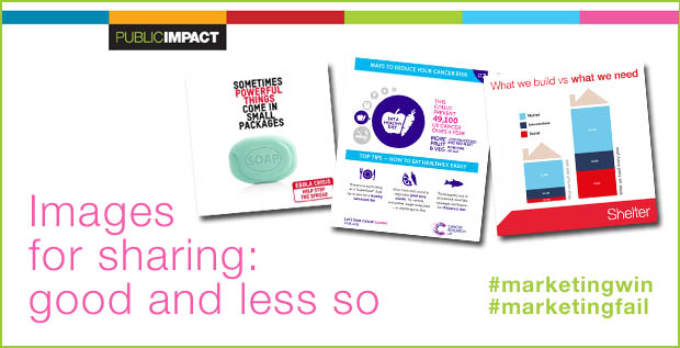
Looking back through my 2014 timeline there were a bunch of images that nicely illustrate 10 rules for not for profit Infographics on Twitter.

Including images with Twitter posts dramatically increases both the effectiveness of the communication and the sharing potential of the post. That means you reach more people with a more memorable message. Not exactly rocket science, but what makes an effective infographic for social media sharing?

The more I looked at the graphics out there it seemed to me that getting it right isn’t so much about learning new rules than it is about remembering some old ones.

You Can’t Control Sharing, Remember the Brand

When an image is shared it is beyond your control. It can appear in any context, anywhere, anytime on anyone’s feed. In fact that’s exactly what you want but you DO want people to know where the image came from – and maybe even what they can do next. So spot the deliberate mistake:

Oxfam_Ebola

This simple image makes a simple point well – strong simple image andunambiguous wording. great, but what now and with who? If you want people to know who you are you might want to brand your image and if you want them to take action you might just want a web address or a hashtag.

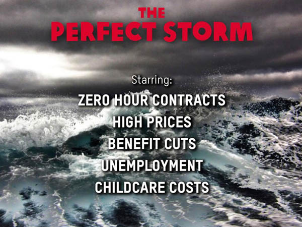
Here’s another – it even caused a fuss in the media:

oxfam_perfect_storm

An easy mistake to make if you are an inexperienced organisation. As it is this was from Oxfam – not that you would know it; detached from their feed it might as well be from another planet!

WWF_wet

Also based on the essential and most powerful advertising formula – this image from WWF UK, who don’t forget to use their powerful brand and web address.

Name Sources for Credible Information

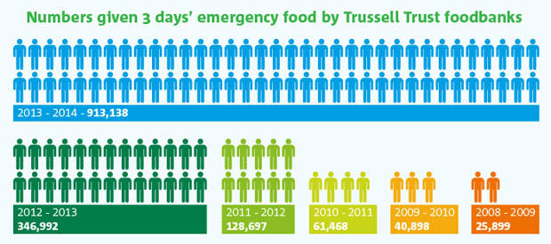
Awareness of message and facts about the issues being championed are often just as important as brand awareness. This is one of my favourite images of last year (and I make no apology for mentioning it again). Simply presented, colourful and powerful, the information speaks for itself. It states its source and the facts from Trussell Trust, operators of Food Banks across the UK, tell the story.

Trussell_Trust_Foodbank_Aid_Public_Impact_Blog

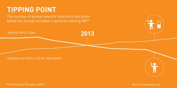
When I saw this infographic on World Aids Day I found the message encouraging – donors want to see the results of their work and when there is good news it needs to be told. The Bill and Melinda Gates Foundationpushed out this good news image with credible data, though once again, it’s unbranded. Disappointing but worse is the monotone presentation of data that could be so much stronger and almost unreadable type – a great story somewhat lost.

Gate_Found

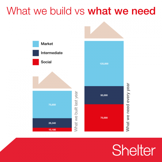
Shelter, the housing homelessness campaigning charity, get it right with this simple image to make their point that UK housing starts run woefully behind the need for homes.

shelter_housing_need

Keep it Simple, Keep it Clear

Twitter is an instant medium so impactful images are best. Also, images work best when their size is optimised to what works best for the medium. Twitter, for example, previews in the timeline at 435×375, Instagram images are square, Facebook – well, it depends on the latest redesign. There are so many networks and they change from device to device that it is hard to keep track of them all. Anyway, the image will be shared on different networks whatever you do – remember you are NOT in control.

All that said there are several good practice points to remember:

  • Make your point simply – less is more
  • Remember there is a limit to what readers can cope with – don’t try to tell the whole story
  • Think carefully about how people read and where their eyes will go
  • Challenge yourself – do you need every element – if in doubt, take it out.

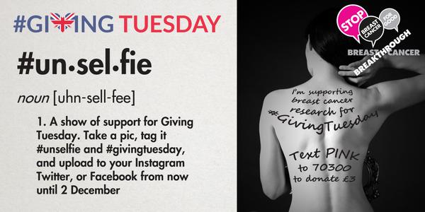
Breakthrough Breast Cancer do great work and their visual campaigns have involved people. There’s a bit too much going on here, but all the essential elements are present.

unselfie

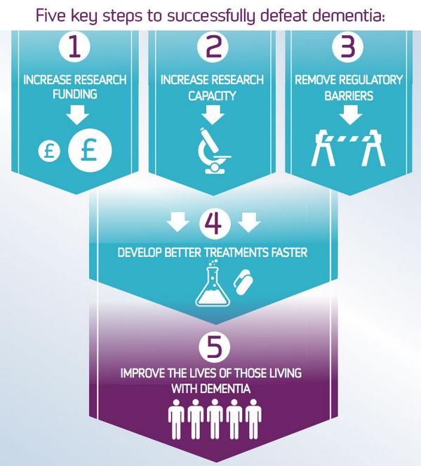
By contrast, Alzheimer’s Research UK explain their mission with this concise image – the only problem is who’s mission are we talking about?

Alz_Res

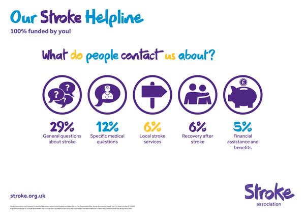
The Stroke Association are almost there with their series of infographics promoting the work of their helpline, and they and aren’t afraid of white space. In fact they get everything right except the use of three colours in a headline which weakens the message.

stroke_assn

Cancer Research UK almost nail it –  it’s a series, it’s simple, it’s informative but they don’t seem to get hashtags! A series of images in a common style is an important way of amplifying your message and increasing recognition.

cancer_research_series

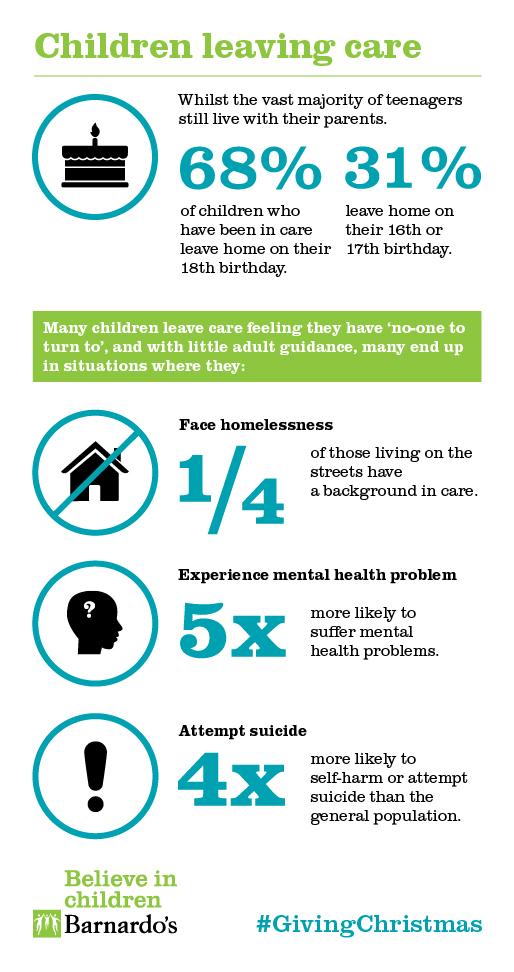
Finally, larger graphic can work on social media so long as there are well designed. Here Barnardo’s get it spot on explaining the facts about children leaving care.

barnados-car

Best Practice with Not for Profit Social Media Infographics

To sum up the 10 rules for not for profit Infographics on Twitter:

  • Brand your images for sharing: whether for blogs or social media
  • Include a call to action and somewhere to go next
  • Hashtags – include them
  • Less is more – don’t try to say too much
  • Think carefully about the size of the image
  • Use colour carefully and keep it on brand
  • Make your facts credible by including a source
  • Make sure your type readable in at 600 pixels square
  • Strengthen your point with a series of infographics
  • Remember how people read – keep it logical
Posted by John Howarth in Creative & Content, Not for Profit, Web & Digital, 0 comments