How to write a design brief

How to write a design brief

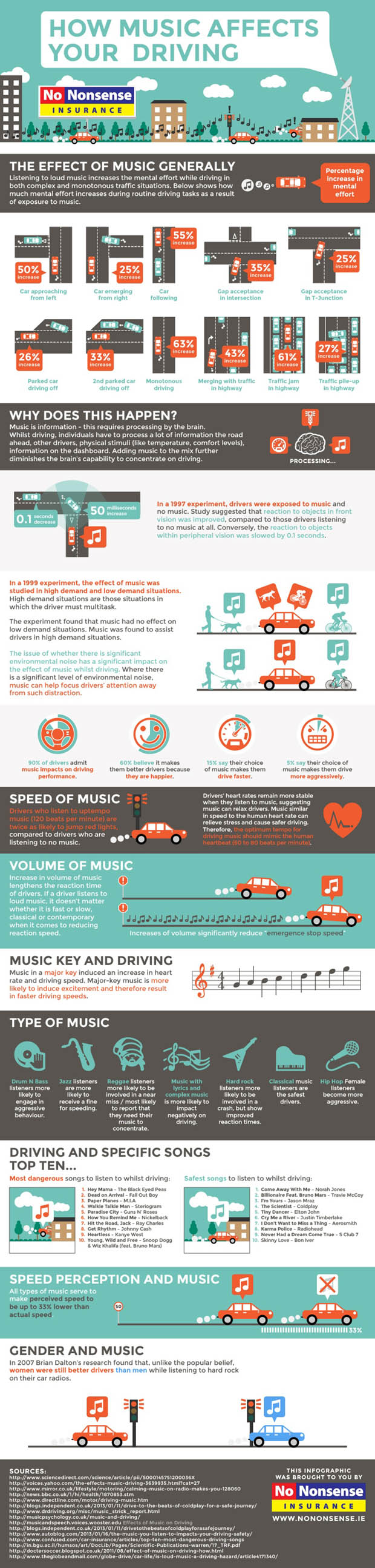
Ever wondered why the design you get isn’t the design you want? Concerned that the perfect message piece you have envisioned isn’t anything like what you get?

So how to get the design you want?

The answer is to set the design brief properly.

Whether you are a designer or a client, an effective design brief is the single most critical factor in ensuring that a project is successful. You can also save money and make your marketing budgets go further by eliminating unnecessary agency fees on-the-fly modifications and author’s corrections. So how do I write a design brief?

What Is A Design Brief?

A design brief is something that is vital to any design project as it will provide the designer/agency with all the information needed to exceed your expectations.

A design brief:

should primarily focus on the results and outcomes of the design and the business objectives of the design project.

should not attempt to deal with the aesthetics of design;that is the job of the designer – don’t get a dog and bark yourself.

should make these things clear before any work starts on the project.

A good design brief will ensure that you get a high quality design that meets your needs, providing you have chosen the right designer. (see our guide on choosing agency).

How To Write An Effective Design Brief

If you answer these questions below in detail, your design brief will be 90% done… the other 10% will come from further questions from the designer after you submit your brief.

What does your business do?

Tip: Never assume that the designer will know anything about your company. Be clear and concise and avoid the jargon of your business sector.

  • What does your company / organisation do?
  • What is your company’s history?

What are the goals? Why?

  • What is the ultimate goal of the project/campaign?
  • What are you trying to communicate and why?
  • Are you trying to sell more products or get awareness of your product / service?
  • How do you differ from your competitors?
  • Do you want to completely reinvent yourself or are you simply updating your promotional material?

Tip: You should also provide old promotional material to assist the designer.

Who is the target market?

  • What are your target market’s demographics? ie. the age, gender, income, tastes, views, attitudes, employment, geography, lifestyle of those you want to reach.
  • Who are your target customers, what do they read, what do they like – if you have typical customer ‘personas’ all the better.

Tip: If you have multiple audiences, rank them in terms of importance.

What copy (text) and pictures are needed?

  • What copy needs to be included in the design? Who is providing the copy?
  • What pictures / photographs / diagrams etc need to be used? Who is providing these?

Tip: This is one of the biggest problems designers face. If they are any good they will be able to help with some of it – but expect to pay for the service. Either way, best to plan in time for this.

What are the specifications?

  • Where is it going to be printed / used? The web, business cards, stationery, on your car, along the side of a waggon?
  • What size is the reproduction going to be?
  • What other information should the designer know in regards to specifications?

Have you got a benchmark in mind?

  • You should provide the designer with some examples of what you consider to be effective or relevant design even if it is from your main competitors. This will set a benchmark for your designer.
  • Provide the designer with things not to do, and styles that you do not like or wish to see in your design. This will give the designer an idea of what to avoid and will avoid disappointment on your behalf.

What are the brand guidelines

The designer MUST be told of any requirements for presenting you corporate or product brand(s)

You should have a manual to hand over – or at least some logo specifications and high quality files. If you don’t have this click here to see how we can help with brand development and brand guidelines.

Tip: Without guidelines any designer will struggle to know what’s on brand and what isn’t – so if you don’t have this then best to address the problem.

What Is Your Budget?

  • Providing a budget prevents designers wasting valuable time and resources when trying to maximise your budget.
  • Providing the budget upfront also allows designers to know if the project is going to be worthwhile to complete. Make sure you are worth their time.

Tip: Designers ten to charge by the hour – so be aware of that and check the cost of any ‘extras’.

What is the time scale / deadline?

  • Give the designer a realistic deadline for the completion of the work. You should take into account the various stages of the design project such as consultation, concept development, production and delivery.

Tip: Rushing design jobs helps no one and mistakes can be made if a complex job is pushed through without time to review, however, there are times when a rush job is needed, and in these cases you should be honest and upfront about it.

When you think about this is all common sense. Telling people what you want is the first step to getting what you want. If you don’t say what you want you tend to get what you deserve.


Revised from the Public Impact blog – Aug 2014.

Posted by John Howarth in Creative & Content, 0 comments
Seven essentials to keep business going in a crisis

Seven essentials to keep business going in a crisis

The ‘it will never happen to me’ mindset is part of the confidence of being in business for many people. But disaster strikes and can it strike anyone, anytime. People die, people get sick, accidents will happen – health and wellbeing are key issues for small businesses. Not especially the health of those directly involved – that you can insure against to some extent, but the health of loved ones, especially those entirely dependent on YOU.

The odds against what happened to a business we know were around 2 million to one – they had done some of the right things – the rest they learned fast.

Because it isn’t a direct risk the fact is very few plan for it. The key is to be flexible enough to adapt, in doing so the following proves indispensable:

A crisis communications plan

This might seem like a luxury that only Big Cos can possibly afford. But it isn’t. In fact a day planning for the worst can prove an invaluable investment. This isn’t because of the cost when something actually happens; it’s because something probably will happen. Having some idea who does what, how the messages will happen, who the key people are – it all makes a difference to how quickly you can get moving again – or how you protect the reputation of your brand. You don’t need fantastic detail – every crisis communications plan has to be adaptable – but an outline should be considered essential.

Great IT support that means you can work anytime, anywhere

Doesn’t everyone these days have the ability to work from anywhere, anytime? Don’t we all have our software in ‘the cloud’ can’t we easily connect to pretty much anything? Err, well no. We were lucky. It had long been part of running Public Impact that a seamless service to client meant being able to access whatever we needed from anywhere in the world. So getting to the office didn’t matter so much. Much more to the point we had a great IT support company who could advise on or set up anything additional that we needed very quickly.

It is important to say that this is not just about being ‘in the cloud’ – it’s about having the right remote access arrangements that are right for you based on you current set up. If you normally do the tech yourself, for good reasons, you may well find that when bad things happen it just isn’t viable to continue that approach.

Good supplier relationships built on trust

All business is built on trust and the greater the trust you have in your suppliers the easier it is to cope when events intervene. Knowing you can effectively delegate key aspects of your work to your supply chain in the near certainty that they won’t let you down is a huge weight off your mind when disaster strikes. So look after your suppliers when times are good.

Work out what and how you are going to tell your clients

Communication always matters – but the decision of how and what to communicate to the organisations with which you do business has to be conscious. Sometimes the right thing IS to do and say nothing – so long as you believe that you can continue to deliver service. Always bear in mind, however, that all business is built on trust. Honesty and openness builds and maintains trust. So considerer whether to say anything, what to say, when to say it and by what channel.

Have priorities, review priorities, make lists

The default for everyone is ‘muddle through’. The reality is muddling through is just that – a muddle. So be clear in your own mind about the priority. For most people top of the list will be the continuation of service deliver. Your reputation as a provider of professional, good value services is paramount – lose that and the damage to your business can become permanent.

So it’s not rocket science – the thing at the top of the pile on your desk or at the top of your inbox is not always the most important. So revise the strategy – go through everything as soon as you get the chance and make lists of everything – then decide what’s got to happen, what’ going to happen and what can’t happen right now . It’s not just sensible organisation, it’s good stress management too.

Scheduling proactively buys time

Once you have your lists you will be able to buy yourself time by scheduling or rescheduling clients into the future to buy time. It’s all about calling them before they call you – you might appear to be creating more work – but by massaging the relationship you keep the door open.

Take one day at a time

Finally, remember why you are doing what you do and that (hush!) life is more important than work. Set you own boundaries for dealing with the immediate issues on your lists, find something good in the day, understand you can’t always make progress but be glad that you’re still here.

Posted by John Howarth in Business, Communications, 0 comments
8 top SEO mistakes & some common sense

8 top SEO mistakes & some common sense

Search Engine Opimisation (SEO) can command high consulting fees which may prove well worth it when your website is finally found on the top page of Google listings. But SEO is not a dark art – it’s much more common sense and the incremental changes Google makes to its search algorithms make it ever more so.

The name of the game for Search Engine Optimisation is extremely simple. Once you’re up and running with the right tools and systems, all you need to do is publish new GOOD content on new pages on your website REGULARLY.

People get so confused about SEO – and it’s hard to see the wood for the trees at times. But, if you want to do SEO correctly, there’s one thing that you will spend the majority of your time doing: writing good content. 90% of the time you spend doing SEO should be spent writing about you, your industry, your business, your products, your services and the problems you solve for your clients.

Alternatively you could fall victim to one of these mistakes.

Top SEO Mistakes (and Common Sense)

  1. You’re optimising your website/blog around really common (probably really popular) keywords that you’ll never be able to rank for. In the last week, don’t pick common words such as ‘Leadership’, competing against Wikipedia and About.com you will never rank.
  2. All of your title tags has the same keyword phrase in it. And it’s your company name. The title tag on a page is probably the most important on-page SEO factor to consider when creating new pages. You probably already rank well for a search on your company name, so you can leave that out and still get that traffic. So, make sure you pick appropriate keyword phrases for each page that are phrases that someone is going to type into a search engine in order to find a product or service like yours.
  3. Dynamic URLs without your keywords in it. You bought a fancy shopping cart or content management system (CMS) that uses dynamic urls with all kinds of random numbers and random letters in the url. Your URLs should be readable by humans because search engines read words like humans too. These days good open source CMS like WordPress or Umbraco just do this – though you can also control urls manually. The words in your URLs is another very important signal to search engines what that page is about. So, get yourself a CMS that allows you to control your urls or get yourself a URL rewriter. Include your keywords in your URLs.
  4. You used images as headings. Headings are usually the big bold letters right above the content at the top of a page usually below your navigation. If these are “words built with images” (designers do this to control the font of the text), search engines aren’t reading them. These should be text. Pick a web safe font that’s close to what you want.
  5. If your navigation is built using image buttons instead of text, you’re giving search engine one less signal about what that page is about. Use text.
  6. Doing SEO after the website is designed and built. For some reason, people think SEO should start afterwards. Plan in the SEO requirements at the start. SEO done right allows you to determine what content to write in order to get traffic from search engines. And you shouldn’t design a site before you know what content will be on it. You may end up with a site that allows you to publish new pages and does not allow optimization of your site around your keywords without paying a designer or agency £££/hour to make the changes and additions for you. Someone that knows SEO will launch your website in a system that allows you to easily do SEO on a continuous basis.
  7. Our design firm “DID” the SEO for us. It’s great that SEO has been planned in but there is no such thing as “BEING DONE” with SEO. It’s an on-going thing. Doing SEO once is like your salesperson saying “I called prospects last month” as a reason for not calling any new prospects this month, what would you say to them right before you fired them?
  8. You built your website entirely in Flash. You might as well put an invisible shield up between you and the search engines because they don’t see you. It is not possible to do anything with SEO on site of this type. It’s back to the beginning with a CMS site.
Posted by John Howarth in Web & Digital, 0 comments
Would you work for nothing?

Would you work for nothing?

Would you work for nothing? We just love this video by Canadian agency Zulu Alpha Kilo. It’s funny and it sums up the kind of nonesense that we folks in the creative industries have to put up with all the time.

Watch it here:

I’ve often asked people who ask things like, “if you do some examples for us and we change our mind will we still have to pay”, this question:

“If you got in a taxi and decided to turn round and go back do you think you would have to pay the fare?”, or
“If you went to Sainsbury’s and bought a pie do you think they would give you your money back once you had eaten it?”

Sadly creative industries, who base their models on time, spend real money creating pitches – you’ve seen Mad Men, haven’t you? OK maybe you haven’t, but the point is Big Advertising with money to burn create this stiuation and it suits them because it keeps everyone else out of the market.

Complaining? I guess we are. But, ok then, tell us. Would YOU work for nothing?

Thought not!

Public Impact is a Digital Marketing Agency based in Newcastle upon Tyne. We provide solutions for marketing managers and business owners want to grow their business by helping to generate more sales leads and contact through better web and social media content.

Posted by John Howarth in Creative & Content, 0 comments
In defence of the numbers

In defence of the numbers

Above: It was You Guv! – the archive figures showing the election neck and neck.

Public Impact Director, John Howarth, has been crunching numbers most of his life. Here he explains why the 2015 General Election did not ‘discredit’ opinion polling and why businesses can and should continue to rely on the numbers.

Say I’m ‘on the spectrum’ if you like, but I’m very fond of numbers. In an uncertain world with shifting motives and inconsistent people numbers are reliable, constant and, ultimately, the only logical truth. Numbers are the friends you can rely on.

At the UK General Election in May the opinion polls were wrong. Of course it wasn’t the numbers as such that were wrong – more a reflection of the people manipulating and using the numbers. Now, apparently, we know why the numbers were wrong – it was all about the sample selection not reflecting the real turnout pattern.

But, of course, there are a few things that could get a little lost in this debate, so because I like to be loyal to my friends I feel the need, before breakfast, to make some points in defence of numbers.

The polls have always been ‘wrong’.

During my lifetime the polls have failed to predict the result of the election on three occasions: 1970 – when the data took much longer to compile and Ted Heath’s ‘late surge’ was missed; 1992 – when they failed to pick up on the electorate’s aversion to the concept of Prime Minister Kinnock; and in May 2015. In each case the election was thought to be relatively close, in each case Labour lost and in each case a ‘late surge’ benefited the Conservatives. However in other elections polls were also ‘wrong’ – but, because the margins were clearer and the winner was in line with predictions, polling ‘error’ was not regarded as such a serious business. For example, in 1997 and 2001 Labour’s lead was over-stated in many polls, in 1983 and 87 the Conservative lead was understated. Nobody made a fuss (1).

The polls are not Labour’s friends – are they?

It is a favorite saying of mine that your true friends in politics are the people who tell you what you need to hear rather than what you want to hear. In that respect the polls have not been Labour’s true friends. Activists of whichever party want to believe that their party, or their faction within their party, is doing well and is going to win. Voter contact by political parties has an in-built confirmation bias – everyone spends more time working on their own supporters, so it often seems like you are doing fine and, in any case, if you didn’t delude yourself you would just go to the pub instead(2). It is a reasonable conclusion, however, to suggest that polls during the 2010 Parliament were consistently ‘wrong’ and so affected the thinking of Labour’s high command. In the light of different information different decisions may have been made – maybe. So their argument seems to be that they really were deluded – just rationally so! Park that thought for a moment.

Never answer a hypothetical question

It’s an iron rule of political media technique that one should not answer a hypothetical question. It is a simple fact that every poll more than a couple of months away from an election campaign is asking a hypothetical question about ‘an election tomorrow’ that is not going to happen tomorrow. People answer that question honestly – they are not being asked how the WILL vote come the real election. Mid-term opinion polls as well as mid-term local elections and by-elections tend to punish the Government of the day. That’s also part of the psychology at play when answering that hypothetical question. They are not making a serious decision about an alternative Government – the electorate is sending a message, either through the ballot box or via the pollsters. The polls provide a snapshot of opinion, yes, a true reflection of what will happen, no.

Crystal balls are mainly just balls

Following from the hypothetical question, polls are not predictions, they are not meant to be. The polling companies always say so. The politicians don’t listen unless it suits them to do so – and in any case no politician can ever say ‘we are going to lose’ – even when it is screamingly obvious that they are. Perhaps we should be less surprised when something that isn’t a prediction fails to predict.

Do the polls ever tell us anything?

Despite all of this the polls tell us quite a lot. They show us movements, trends, patterns. Their relative position against real results can produce reliable estimates around which decisions can be made about campaigns and resources. They can show regional differences. They are often ‘right’ in relative terms even when they are ‘wrong’ in absolute numbers. This is what number crunchers do – we learn to read the numbers. There was much in 2015 that the polls had to tell – the Labour Party just didn’t want to hear it. This is why it is self-serving nonsense to suggest that Labour’s high command may have made different decisions in the light of different polls. I don’t think so – the justification for inertia would simply have been different. Labour claim’s that they were ‘duped’ by the numbers doesn’t stand up to analysis. This delusion was far from rational – they only saw the numbers they wished to see while the reliable indicators told a different story – as did others (3).

There is no great polling conspiracy – so be very afraid

Some peddle the crazy notion that opinion polls that present uncomfortable evidence are part of some great conspiracy. Sadly this is part of a world view that is equally help at the extremes of left and right and is, I’m afraid, entirely barmy. The numbers are what they are. The polling companies do not want to be wrong because being seen to be wrong is bad for business, not least because they are generally correct. The real horror for Labour, given that polling ‘bias’ has now been proven to ‘favour’ Labour, is not what the polls said about the outcome of the last election it’s what they are saying right now.

It remains a fact that people lie, numbers don’t.

Notes

(1) the evidence of this is ample – see the various Butler et al publications detailing polls and results, the work of Thresher and Rawlings and the likes of John Curtis.

(2) when the appeal of a party is narrow but deep this effect can be even more pronounced – which is why in both 1983 and 2015 Labour activists reported ‘great ethusiasm’ on the doorstep. Their delusions weren’t entirely baseless – but it didn’t mean they weren’t getting thrashed.

(3) see Andrew Rawnsley’s mea culpa piece in The Observer, 17 Jan 2016.


Posted by John Howarth in Business, Communications, Public Affairs, 0 comments
Content marketing distributors confirm trend to visual media

Content marketing distributors confirm trend to visual media

Digital marketing trends for 2016 look set to continue the long-predicted shift toward visual and audio/visual media. Figures for 2015 compiled by Lionbridge for the Content Marketing Institute and eMarketer show a significant increase in the use of visually-based social media for the distribution and promotion of content.

In particular the survey indicates that the proportion of content marketers using Instagram has almost doubled from 2013 – by far the biggest proportional increase. While some of this reflects consolidation within social media the bulk of the increase, as this blog predicted some time ago, is also because of the major brands now regarding Instagram as a serious and effective channel for brand promotion alongside the growth of the network under the ownership of Facebook since 2012. Go behind the figures, however, and an even more fundamental trend is pushing these figures. Instagram has always been primarily a mobile medium. It’s no surprise then that it should grow and be seen as more important by marketers as mobile devices account for an ever larger share of internet access.

content_marketing_social_network_trends_public_impact

The continued growth in the use of YouTube and, to a lesser extent Vimeo is in line with the desire to engage through video content. However, while more people are using video there remain serious questions about how well they are using the medium. The overwhelming majority of self-produced video content deployed on the internet remains virtually unwatchable. Webinars have the same problem. The significant growth in SlideShare – acquired by LinkedIn some time ago is hardly surprising. Sticking to the devil you know, the PowerPoint deck, offers an achievable means of distributing content with a minimal learning curve. Pinterest, where the user really needs to search and seek out content rather than have it offered on a feed, offers a more haphazard channel an one that seems altogether more difficult to measure – as marketers seem to be discovering. Pinterest seems set to remain ‘niche’.

As for the other networks, the level of use of Twitter and Facebook means there is only one way to go – and we should expect a decline at some point as marketers, still experimenting with social media refine their mix of channels. Google plus, however, continues to grow despite its change in direction, its usefulness in assisting search being central to its appeal. However Public Impact’s experience talking to businesses using social media in Newcastle upon Tyne and in Berkshire suggests that there is a long way to go before UK businesses and not for profit organisations use content marketing and social media marketing to their full potential.

Posted by John Howarth in Creative & Content, Web & Digital, 0 comments
5 simple points from 2015 infographics

5 simple points from 2015 infographics

Digital marketing is nothing if it isn’t visual. Getting better results from social media posts and ensuring that web site content produces sales leads are projects considerably aided by effective visuals. We’ve been looking at the simple points make by standout 2015 infographics.

Looking around visuals in 2015 a few have stuck in my mind and illustrate nicely some of the key points about more effective infographics (all copyrights acknowledged – in praise of the work of others – see links as appropriate).

Unity Makes a Point

A little cruel this one but it gets the point across nicely – it takes longer to get digital marketing up to speed than you think. The strong, unified single image and strong headline makes an instant point that draws you toward the detail. Not sure the five year timescale is valid, but the main point stands.

digital_evolution

Just the facts?

This image from The UK Government Department for International Development (DfID) spells out the facts of aid from the UK to Syria since the crisis began in 2012 in a series of stark images. The image presents as simple and truthful without making judgements. Like all facts they have a context – and they are the starting point of discussion. So much easier when there is clarity and a logical reading order. Have a look at the points we make here about not-for-profit infographics.

syria_aid

Doing a lot

Local Authority budgets are the stuff of sleepless nights for some and for the rest a cure to insomnia. Councils do a lot and deliver a lot – and it’s hard to take in. Plymouth City Council produced a excellent series of infographics to put across the scope of their budget using simple graphics on a clean background. Make a dry subject come alive with vibrant colour.

ig1516budgethelpdeliver455

Fantastically complex but still fun

The Oscars have a reputation for playing safe and ‘The Academy’ is often dreadfully predictable. Apparently this is how to win an Oscar if you are a lead actor. Simples. The hard part, of course, is becoming the lead actor in the first place. The detail is impossible to see but that’s not the point – it’s the aggregation that’s important – an if you are really interested you can find the full size version on the link here.

OSCARS_landscape_1

Challenging assumptions  

This one is interesting. Who thinks listening to music helps their driving. I see a lot of virtual hands in the cyber air there. Wrong, probably. This one give some of the facts, seeks to educate, conveys lots of complex information but leaves out some essential facts. Like how on earth could it be that listening to Coldplay could possibly help anyone do anything?

music-affects-driving-infographic

Posted by John Howarth in Creative & Content, Web & Digital, 0 comments
Business dining in Newcastle upon Tyne

Business dining in Newcastle upon Tyne

Public Impact Director, John Howarth has written newspaper and magazine columns on food (among other things). He didn’t take much persuading to write this one on business dining in Newcastle upon Tyne.

One of the most noticeable changes in Newcastle in recent years is the improvement in the food offerings available through the City. In fact Newcastle has just got its first Michelin starred establishment (at least in recent years), House of Tides.

People in the North East have always liked their food and most have preferred it in substantial portions, however in the past the fare on offer has lacked some variety and maybe a bit of spice. Like the rest of the UK food has come on a bit, but over my visits in the last few years I’ve notices the change more and more. Checking out the listings magazines and online reviews there are more and more food events, farmers’ markets, specialist food stores and restaurants emphasising local ingredients not to mention the flowering of local craft breweries. From my point of view it is also great to see the continued success and development of independent (by which I mean non-chain) outlets.

Picking restaurants carefully using trusted online and offline sources we’ve been lucky to have some pretty good eating experiences. At a networking event I was attending I got into a conversation over the bacon sandwiches and my interest in food and cooking came up. The conversation turned to business lunches and which Newcastle restaurants are best for business dining?

For business dining, we want reliably good food and decent service, of course but also somewhere you can talk easily, where you’re not going to be hurried out the door and where you will feel you have had decent value for money. There is a balance when entertaining clients or thanking suppliers. The psychology isn’t about the total of the bill. The people you work for and the people you work with will get mixed messages from splashing the cash. That said, I was once taken to lunch by a supplier to whom we had channelled very significant business. I can still remember the restaurant they chanced upon with no prior knowledge. with the care-home decor and half-defrosted starters. They were very deeply embarrassed.

So:

  • ALWAYS check the online reviews as well as friends’ recommendations or your personal experience. Things may have changed – the management, the chef, the suppliers. So give most credence to the most recent reviews and give most weight to longer reviews – they are written by people who care about their dining experiences.
  • BUT be a little sceptical – learn to ‘discount’ the ratings somewhat. For example, Trip Advisor ratings out of five – as their scale is skewed (Terrible, Poor, Average, Very Good and Excellent). There are a lot more ‘very goods’ and ‘excellent’ than places really deserve. Also, people are much more likely to be critical of service than they are of food.
  • CHECK the opening and closing times – you don’t want to be chased out but you don’t want to overstay your welcome either.
  • BOOK (which may seem obvious but you would be surprised how many don’t bother) tell them it’s a business lunch/dinner and ask for a table where you can talk discretely. Your guests will appreciate the trouble you have taken more than they will having you spend your money.
  • ASK your guests what they do/don’t can/can’t eat. These days restaurants that have got their act together will ask about dietary requirements, food allergies and so on – you don’t want to be calling back to find out. And BE CAUTIOUS – it’s best to play safe, at least first time out.
  • BRIEF the person who actually does the booking on what you need from them – don’t expect them ‘just to know’.

So, not my ‘top five’ restaurants in the region, not my favourite food necessarily, not the best place for a romantic night out or the office party but good environments to do business and all with nearby parking:

artisan

16 Stoddart Street. NE2 1AN

Next door to The Biscuit Factory – a privately funded and run gallery and event venue in the much regenerated Sandyford district. Very good, modern regional food in a roomy setting. The menu emphasises the seasonal and changes regularly. There are sets for lunch and dinner which represent decent value. Good, strong flavoured game. artisan, note the lower case and the underscore, keeps it simple and does it well – and there is a lot to be said for that.

Peace & Loaf

217 Jesmond Road. NE2 1LA

Run by a former Masterchef Professional finalist, Dave Coulson and another excellent modern British experience that offers a great value prix fixe – £14 two courses £18 for three the last time I looked – though you can spend as much as you like in a place like this. Peace & Loaf verges on fine dining– but is more relaxed than the term suggests. If you know your guests like their food and you want to take them somewhere with adventurous but not wildly ‘out there’ dishes then this is a good choice.

21

Trinity Gardens, NE1 2HH

21, formerly Café 21, is now just 21, or maybe it’s 21 Newcastle. All very confusing. There is now a Café 21 in Fenwick’s – the City’s flagship department store. So be clear where you are going. 21 is near the Quayside and is, without doubt, decent quality with a prix fixe than is good value – but be warned the a la carte is somewhat overpriced. 21 wouldn’t be my firsdt choice for a cosy night out but it’s clean modern bistro lines, crisp white table cloths and comfortably large tables make it a good comfortable business choice.

Marco Pierre White Steakhouse

Hotel Indigo, 2 Fenkle Street. NE1 5XU

Modernist and functional, Hotel Indigo is a good space for a business lunch. The Steakhouse isn’t just about steak – but the steak is very, very good. You can be reasonably cynical about a serious chef like White taking the advertising cheque for stock cubes who doesn’t exactly drop in every day but give the food a chance – it is reliable and the lunch set is locally designed rather than handed down from on high. Good, efficient service and a nice informal bar to slide into – especially if your lunch is on Friday.

A Taste of Persia

14 Marlborough Crescent. NE1 4EE

This one is my wild card. If you know your guests and you know they like something different then you could do worse than try A Taste of Persia. Persian food is about flavours rather than fire, so most palates can find something they will enjoy. The exterior is not attractive, the interior is basic but the food is very good indeed, different and very worth the visit. So be clear – this has to be sold on the food and you have to know your client is up for it, in which case you’ll be introducing them to a real treasure. There is a sister branch in a Jesmond hotel – but this is the original and rules are there to be broken.

And if this lot won’t do it for you there’s a lot more to food in Newcastle than there ever was – so we might do another of these blogs sometime soon.

Posted by John Howarth in Business, 0 comments
5 Reasons Webinars Fail

5 Reasons Webinars Fail

I joined a webinar recently during which the will to live drained from my being – the presenter was a senior executive in a tech operation of significance. It isn’t the first time it has happened and I doubt it will be the last. To get the 90 minutes of my life that I’ll never have again out of my system I thought I would jot down these 5 typical reasons webinars fail in the hope that some will read and take not.

The webinar is a great notion – we can attend a presentation without having to leave our desks, travel, burn fossil fuel, catch someone else’s cold on the tube. It should all make us more efficient and help us marketing folk reach far more people than we otherwise would. The sad thing is there are many more bad webinars than good webinars. This is extraordinary because the media that define the rules has been around for many year: TV and radio. So apply a little common sense in to avoid the most common webinar mistakes.

It’s always too long

Think about TV formats. This is the stuff we have grown up watching. 40-50 minutes is a full drama episode – most often broken up by commercials. 22-25 minutes is a sitcom episode, 10 minutes in a news bulletin. These formats define our attention span. 90 minutes is a feature film!

The reality is left to our own devices the presentations we devise are always too long – it’s just the way we think as presenters – the more detail we provide, the better we feel we are doing; we want to tell people about the great things our brilliant products do – so we do, endlessly. But I also noticed that some people presenting webinars just ramble.

People turn off – or worse they invest more time feeling that they have wasted half an hour already and become steadily more irritated.

Who needs rehearsals?

Everybody! But it is quite evident that many of the webinars I sit through are entirely unrehearsed. The presenter is running through a demonstration or a PowerPoint deck without a script, without an opportunity to think about how they come across and without a ‘critical friend’ (or, God forbid, a director) who will challenge their performance and point to something better.

Of course it isn’t always practical to have others crit you webinar technique – but the technology is there to allow you to record the session and play it back through. Self-criticism is better than no criticism. Then there is the CEO, CTO or other Grand Fromage who floats in and delivers their rambling words of wisdom at great length. Needless to say there is a need for processes that apply to all if companies are to improve the standard of their on-line presentation.

One voice is rarely enough

Think about radio – most spoken word radio presentation is a conversation. The single voice reading or lecture is rare and the territory of professional voice artists, actors and so on. The single voice talking at length is a rarity, they make for dull presentation that struggles to hold the attention. It’s not that different when the webinar uses video streaming of the presenter. Ask yourself how long a single face to camera shot on TV lasts? Not that long – rarely more than 20 seconds and almost never longer than a minute – even on serious news broadcasting. A single talking head to camera will always struggle to hold attention for much longer.

PowerPoint (other similarly problematic presentation tools are available)

Too often, however, webinars simply reproduce all the mistakes of bad PowerPoint presentations over the wire: a single voice talking for far too long over a static slide, a single voice reading out the bullet points word-for-word, slides carrying too much information, too much text, over complex diagrams or badly designed visuals. It doesn’t work in a seminar room so why would it work online? A single voice talking over a PowerPoint deck can work in a webinar, so long as the deck is to the point and effective and the presenter is concise – though more than one voice is always better.

The demo that never ends

Technical demos also too often drone on forever with limited visual interest losing the interest of the viewer and failing to get the point across. This isn’t really the fault of the technical presenter, the failure comes down to the webinar producer who, even if they plan the rest of the webinar, simply hand over the demo to the technician.

Just like any other aspect of a presentation demos should be rehearsed, challenged, shortened and broken up into manageable chunks with contrasting voices. And like everything else the demo should be rehearsed. If the technical demo is central to the webinar then it is too important to be left to the techies.

Producing More Professional Webinars

So are your webinars key to your marketing strategy? If they are an early form of engagement with a potential customer then why on earth would they not be? If your approach is professional, rehearsed, well scripted, incorporates decent visuals and avoids the reasons webinars fail you will look good and retain interest. If not then what are you doing webinars for in the first place?

Posted by John Howarth in Communications, Web & Digital, 0 comments
10 Easy Ways to Write Better Not-for-profit Blogs

10 Easy Ways to Write Better Not-for-profit Blogs

Blogging is a fantastic tool for NGOs, charities and not-for-profit organisations. So why are so few UK not-for-profit organisations using it effectively? Analysis of the UK’s top charities reveals that only a small minority are using their blogs to maximum effect.

Blogging is an excellent way for NGOs, charities and not for profit organisations to engage new supporters and to raise the profile of the organisation on the web. Blogs get found by search engines and though the largest non-profits will be found easily through name recognition and direct search their home page won’t necessarily hold the information that the viewer is looking for.

Small and medium sized non-profits have most to gain from blogging

So even for the largest NGOs not to have a blog that engages supporters is a missed opportunity. But true as that is how much more important is that to the next tier? Small and medium sized not-for-profits have the most to gain from writing a better blog. Non-profit SMEs don’t have the pull of a household name, a massive research cause or a big TV ad campaign to support them – so they need to be found online and a well written, well promoted blog is one of the most cost-effective ways to get found.

BUT REMEMBER – running a blog take time and resources – most of all IT ISN’T FREE. So think it through before you start.

The_Power_of_Not_for_Profit_Blogging_Infographic

Here are ten easy ways to write better not-for-profit blogs and to use blogging to get more supporters and donors for your charity.

Use Lists

People love lists, the web loves lists but most important of all people search for lists. So ‘ten things you must know about your cause’ is always a great starting point for a blog post.

Titles and Headlines

Spend time thinking about headlines and titles. Because they matter – a lot. Ask yourself:

  • Will they include search keywords?
  • Will they capture attention?
  • Will they get a message across that the article matters?
  • Do they accurately describe what the article is about?

Structure and Layout

Design at every level is about providing an effective solution to a problem – not just looking good. Typographical design and blog structure matters because people read differently online to on paper. So use:

  • sub heads that describe content effectively
  • bullet points that make information easy to read.
  • hyperlinks to other content and useful information (that also helps SEO)
  • emphasis to get the most important point over

Short paragraphs, concise sentences

Online articles need pace and space. As well as a structure that makes it easy to scan your article quickly keep your sentences short. Think carefully about how you use paragraphs. While it may not be entirely correct to use three short paragraphs when you might use one in print it will make the piece more readable.

Not just words

Blogs are not just words. They can be infographics, collections of images, animations, sound files or video. All these things help the mix and keep it interesting for your readers. Remember too that every blog should have an image because images are found by search engines too.

Plain English is for people

Every profession has its lingua franca and every organisation has its jargon. Do yourself a favour and drop it – or at least keep it out of your blog. Why? Because it’s not about YOU. It’s about your potential supporters and they speak English! (or they speak French, or Spanish – but the same point holds – they don’t speak your jargon).

Current makes it matter

Writing about something that’s in the news right now is great – but it’s not always possible. Even so taking a peg of some sort from the news and hanging older content onto it is an excellent way to produce new blogs from old, making work that you have already done relevant to a new audience. Also not for profit websites are stacked full of information that can easily be turned into a blog and hung on news or current events.

Anecdotes make it real

Dry content that presents facts is all very well but especially in non-profit writing it is good to make blog stories about the real world. So include examples, user stories and anecdotes. In fact they are sometimesthe anecdote can be the inspiration for the whole blog.

The mission matters most

Non-profit blogs need to be varied and present their information in many different ways but remember that viewers become supporters, supporters become members and sympathisers become donors because they understand exactly what you do and the difference that their contribution can make to something they care about. That’s why your mission has to be part of what your blog is all about.

Now ask the reader to DO something

This is where most non-profit blogs fail. They tell an interesting story, they point out how important it all is and then they fail to ask the reader to do anything – whether it is to donate, join or sign a petition. A blog without a call to action is not worthless but it belongs in the academic world or the media – In non-profit it is a missed opportunity.

Posted by John Howarth in Creative & Content, Not for Profit, 0 comments